Let's talk
From Primary to Tertiary: The Designer’s Guide to Perfect Button Usage
Date
Category
UX/UI Design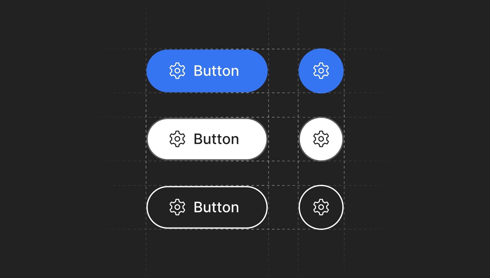
Throughout my years of experience as a digital product designer, I have encountered numerous scenarios where developers and designers do not fully understand the differences between primary, secondary, and tertiary buttons. Even when these differences are understood, they are often used incorrectly. This “design note” aims to clarify these distinctions and provide clear guidelines on when and why to use each type of button, to improve user experience (UX) and consistency in user interface (UI) design.
What are Primary, Secondary, and Tertiary Buttons?
Primary Button
The primary button is the most prominent and is used for the main action you want the user to take on a page or screen. Its design is usually the most eye-catching, using contrasting colors and a larger size compared to other buttons. This type of button acts as a beacon, guiding the user towards the most crucial action they need to take at that moment.
Characteristics:
- Eye-catching and contrasting color: The color should be the most prominent in the interface to immediately draw the user’s attention.
- Strategic placement: It is usually placed in a prominent and accessible location, such as the center of the screen or the bottom right.
Example of use:
It is very common to use primary buttons in pop-up or modal windows to highlight the main action to be performed by the user, such as confirming a download or deleting an item, etc. These buttons are generally designed with colors that represent the brand or product identity and strategic positions to guide the user to the desired decision, while secondary and tertiary buttons, less prominent, offer alternative options, such as canceling the action.

Secondary Button
The secondary button is less prominent than the primary and is used for actions that are important but not the main one. These buttons complement the primary action and are designed to be visible but without competing with the primary button.
Characteristics:
-
Less eye-catching color: Although it should be visible, its color is usually softer and less contrasting compared to the primary button.
-
Accessible but not dominant position: It is placed near the primary button, often to the right or below it.
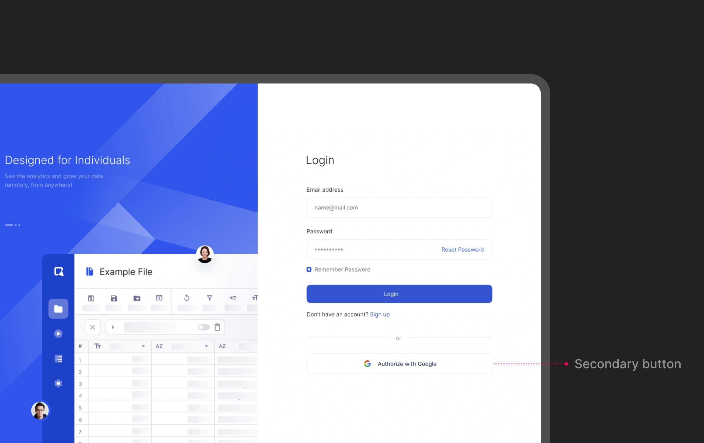
Example of use:
On a registration page, the “Sign in” button could be the primary button, while the “Authorize with Google” button (or other registration methods) would be secondary. This button offers an additional option without diverting attention from the main action.
Tertiary Button
The tertiary button is the least prominent and is used for secondary or additional actions that are not essential to the user’s main flow. These buttons usually have a subtle design to avoid distracting from the main goal.
Characteristics:
-
Neutral color and discreet design: It uses colors that blend well with the background, such as gray or pastel tones.
-
Less prominent position: It is placed in less noticeable places where the actions do not interrupt the main flow.
Example of use:
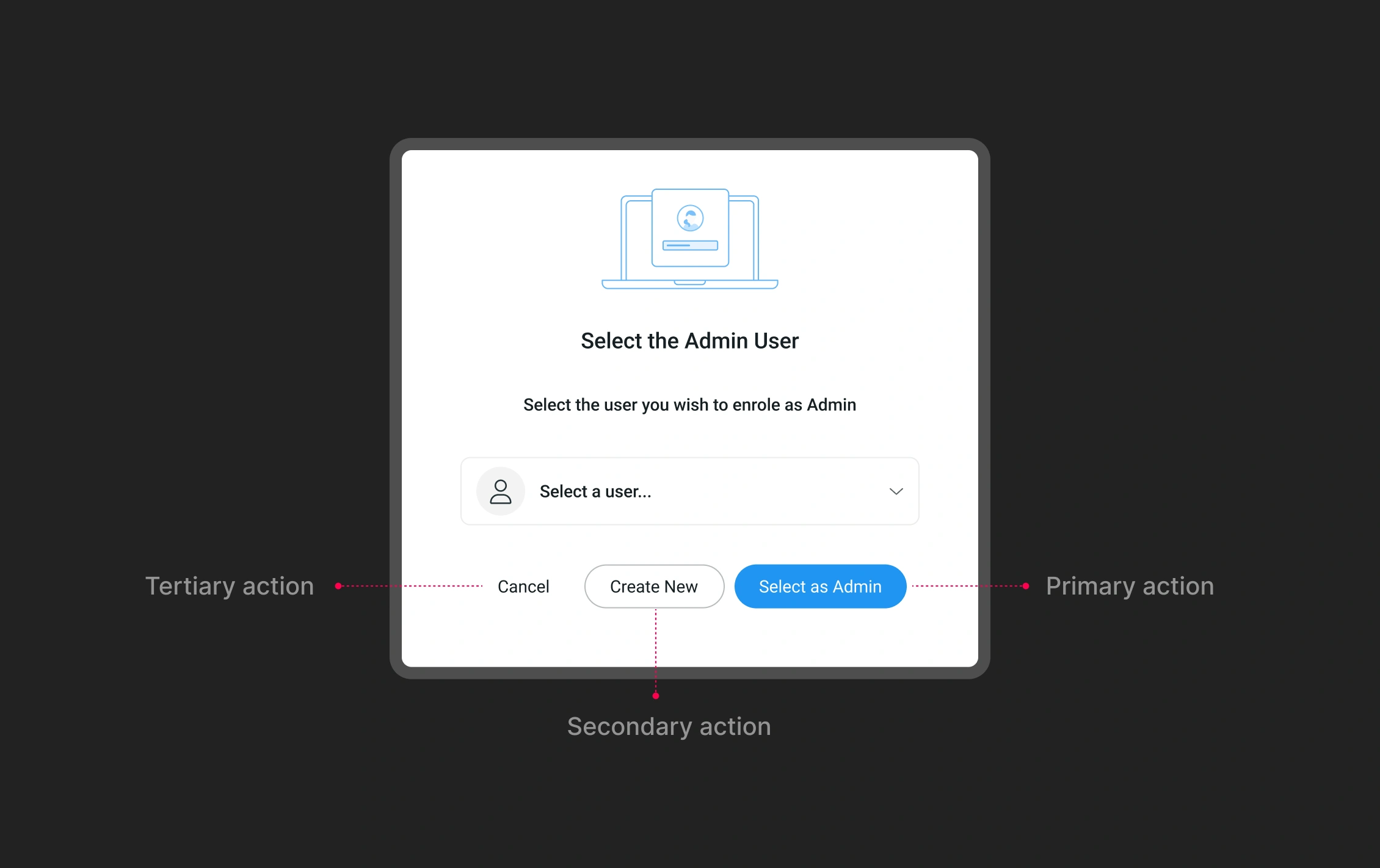
it is very common to find popup windows with 3 or more actions, the following image shows a clear example of when and how to use the tertiary button, because in this case the action “cancel” is the least relevant in this context.
Why This Confusion Occurs?
Lack of Education and Training: One of the main reasons for the confusion is the lack of proper education and training in UX/UI design. Many developers and designers learn on the go, without a deep understanding of best practices. This can lead to misunderstandings about how and when to use different types of buttons.
Influence of Bad Examples: The presence of poor examples on the web also contributes to the confusion. Poorly designed websites and applications can serve as incorrect references, perpetuating the improper use of buttons.
Pressure to Release Products Quickly: In the world of digital product development, there is often considerable pressure to release products quickly. This can lead to rushed design decisions where the distinction between primary, secondary, and tertiary buttons is not carefully considered.
Lack of Consistency in Design: The lack of clear and consistent style guides within a team or company can result in inconsistent application of buttons. Without a clear guide, each designer may interpret differently when and how to use each type of button.
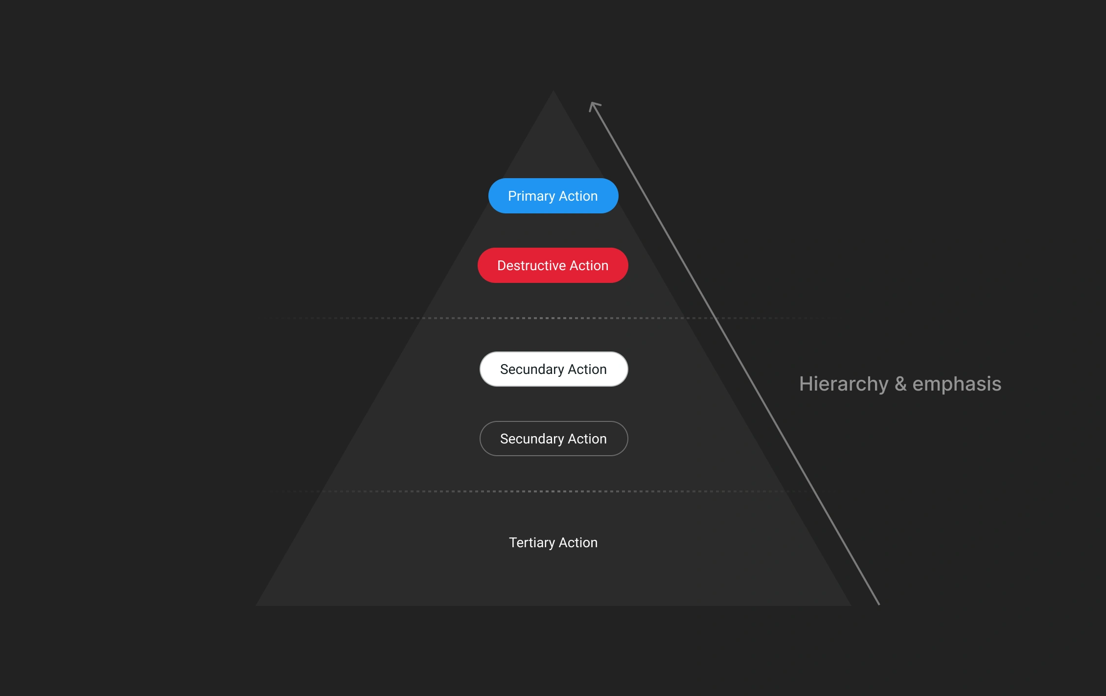
Main Guidelines and Best Practices
Define a Clear Hierarchy: It is crucial to establish a clear hierarchy for actions in your interface. Identify what the main action you want the user to take and design the primary button to highlight that action. Ensure there is only one primary button per page or screen to avoid confusion.
Use Color Contrast Effectively: Effective use of color is fundamental. Primary buttons should have colors that significantly contrast with the background and other interface elements. Secondary and tertiary buttons should have colors that indicate their lower priority.
Maintain Consistency: Keep consistency in the use of buttons throughout your application or website. Use the same styles and colors for primary, secondary, and tertiary buttons everywhere so users can learn and easily recognize main and secondary actions.
Consider the User’s Context: Always consider the user’s context and needs. Ask yourself what the most important action is at each moment and design accordingly. For example, in a purchasing process, the primary action will be to complete the purchase, while on a profile page, it might be to update personal information.
Conduct Usability Testing: Do not underestimate the value of usability testing. Observe how users interact with your interface and adjust the button design based on their behavior and feedback. Usability testing can reveal problems you had not anticipated and help you improve the user experience.
Document and Communicate: Document your design decisions and communicate them clearly to the entire team. Create detailed style guides that specify how and when to use each type of button. Ensure that all designers and developers understand and follow these guides.
Conclusion
Understanding and correctly applying primary, secondary, and tertiary buttons is essential to creating a coherent and efficient user experience. By following these guidelines and best practices, you can ensure that your users not only find your interface intuitive but also can complete their tasks efficiently. Remember that user-centered design is not only about aesthetics but also about functionality and ease of use. Happy designing! ;)
References*
-
“Designing the Perfect Button – UX Magazine”
This article explores the importance of button hierarchy and provides practical examples and best practices for designing effective buttons. It highlights the need for clear visual cues and strategic placement to ensure buttons serve their intended purpose efficiently.
-
“What is Visual Hierarchy? — updated 2024 | IxDF”
This guide discusses the principles of visual hierarchy, including the use of size, color, contrast, and positioning to prioritize information and guide user attention. It emphasizes how these principles can be applied to button design to enhance user experience.
-
“A guide to visual hierarchy in UX design – LogRocket Blog”
This comprehensive article explains the concept of visual hierarchy in UX design and how it can be used to create intuitive and user-friendly interfaces. It includes examples and techniques for implementing effective visual hierarchy, particularly in button design.
-
“Visual Hierarchy in UX Design: Guide + 9 Great Examples – CareerFoundry”
This article provides an in-depth look at visual hierarchy, its importance in UX/UI design, and practical examples of how to apply these principles to create more effective designs. It includes specific references to button hierarchy and its impact on user interactions.