Let's talk
Consistency in Required Fields: An Emphasis on the Convention of the Asterisk
Date
Category
UX/UI Design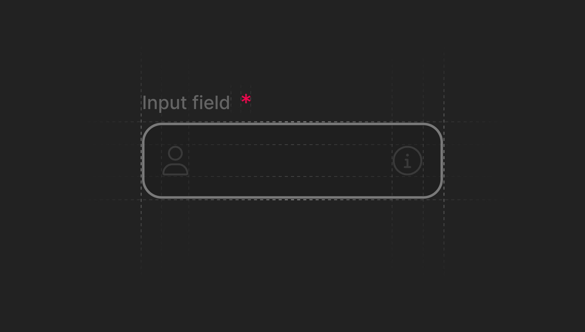
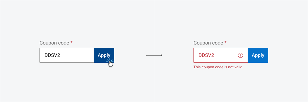
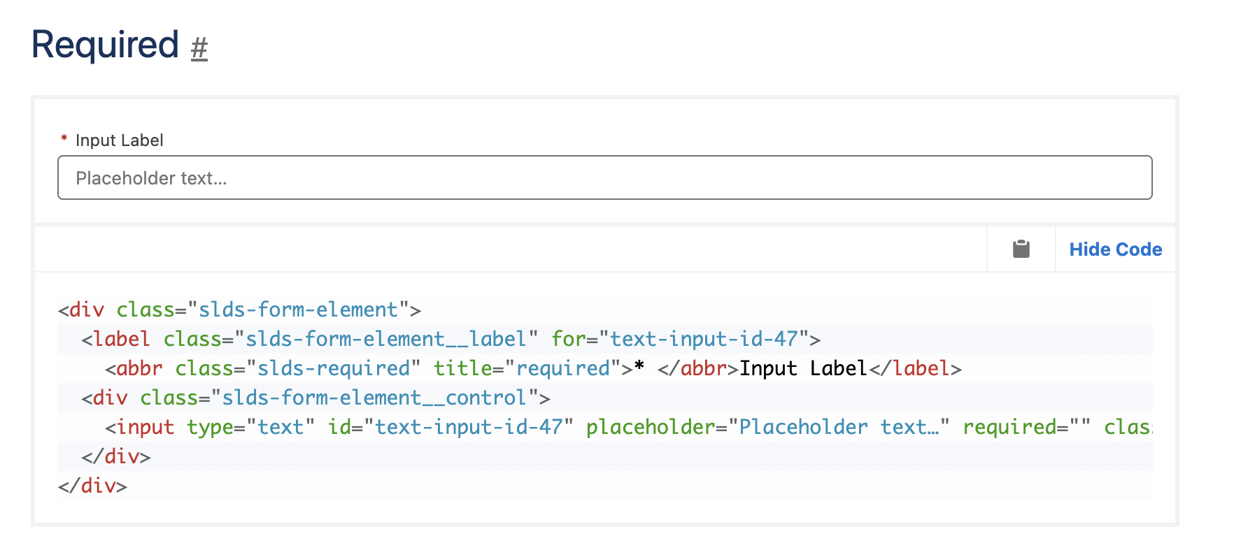
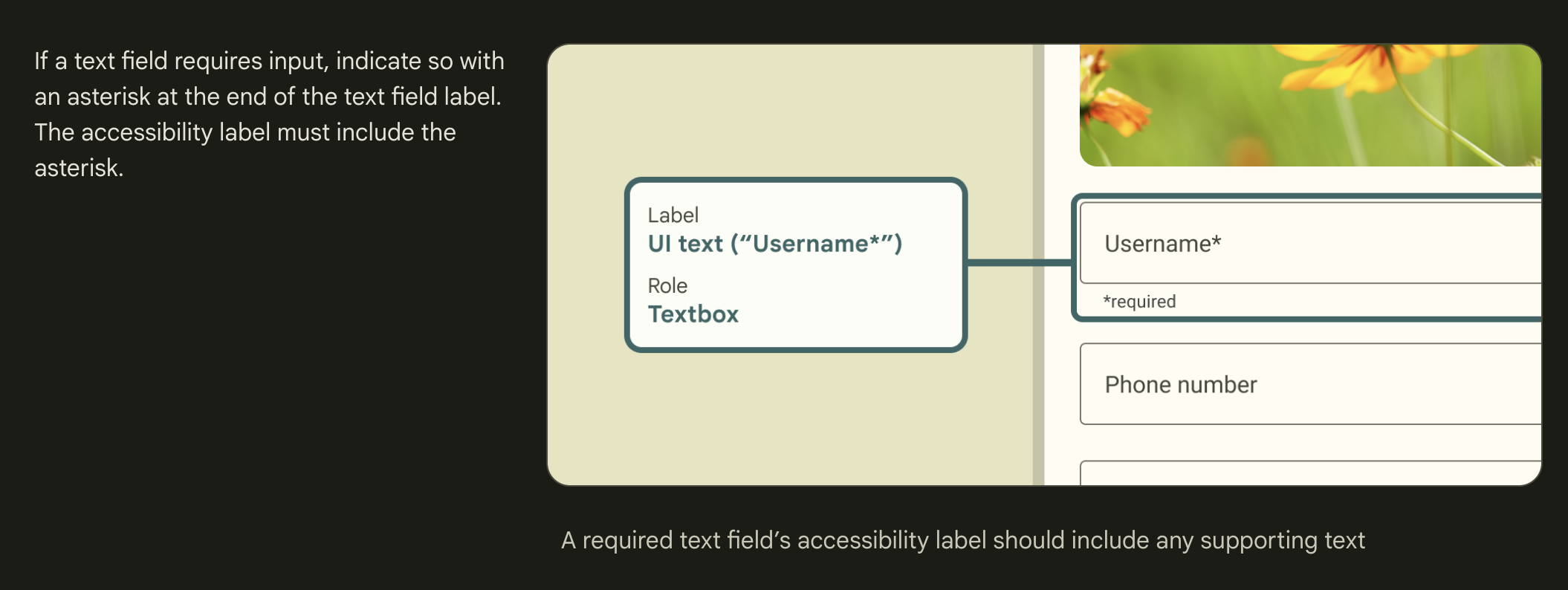
In my recent experience as a consultant for a software development company—whose name I cannot disclose due to confidentiality policies—I encountered a dilemma that highlights a common debate in user interface design: the signaling of required fields in forms. The product managers (PMs) at the company proposed a shift to a more conspicuous marker than the conventional asterisk (*) for mandatory fields, arguing that it would be more effective in drawing user attention. This proposition led me to conduct thorough research and reflect on the importance of adhering to usability heuristics, particularly “consistency and standards.”
References*
- Nielsen, Jakob, and Rolf Molich. “Ten Usability Heuristics.” Nielsen Norman Group. Available at: Ten Usability Heuristics – Nielsen Norman Group
- “Form fields — Required vs Optional.” UX Collective. Available at: Required vs Optional – UX Collective
- “Material Design Text Fields.” Google Material Design. Available at: Text Fields – Material Design.
- “Web Accessibility Criteria – Required Fields.” California State University, Northridge. Available at: Web Accessibility Criteria – CSUN
- “Rethinking the Red ‘Required’ Asterisk for Better Form UX.” Fusionbox. Available at: Rethinking Required Asterisk – Fusionbox
- “Using asterisk (*) vs required.” User Experience Stack Exchange. Available at: Asterisk vs Required – User Experience Stack Exchange.
- “Designing Efficient Web Forms: On Structure, Inputs, Labels And Actions.” Smashing Magazine.
- “User Interface Design and UX Design: 80+ Important Research Papers Covering Peer-Reviewed and Informal Studies.” Interaction Design Foundation. Available at: UI/UX Design Research Papers – Interaction Design Foundation.
Conclusion
In conclusion, while the PMs’ proposal at my client’s company sought to innovate in signaling the importance of certain data, research and reflection on usability heuristics and industry standards led me to advocate for the use of the asterisk. This approach not only aligns our product with established practices but also respects usability principles that ensure a coherent and accessible user experience. In UX/UI design, often the traditional, if based on a logical and proven convention, can be more beneficial than novelty for novelty’s sake.
References*
- Nielsen, Jakob, and Rolf Molich. “Ten Usability Heuristics.” Nielsen Norman Group. Available at: Ten Usability Heuristics – Nielsen Norman Group
- “Form fields — Required vs Optional.” UX Collective. Available at: Required vs Optional – UX Collective
- “Material Design Text Fields.” Google Material Design. Available at: Text Fields – Material Design.
- “Web Accessibility Criteria – Required Fields.” California State University, Northridge. Available at: Web Accessibility Criteria – CSUN
- “Rethinking the Red ‘Required’ Asterisk for Better Form UX.” Fusionbox. Available at: Rethinking Required Asterisk – Fusionbox
- “Using asterisk (*) vs required.” User Experience Stack Exchange. Available at: Asterisk vs Required – User Experience Stack Exchange.
- “Designing Efficient Web Forms: On Structure, Inputs, Labels And Actions.” Smashing Magazine.
- “User Interface Design and UX Design: 80+ Important Research Papers Covering Peer-Reviewed and Informal Studies.” Interaction Design Foundation. Available at: UI/UX Design Research Papers – Interaction Design Foundation.