Easypermit
Client
Easypermit Corp.
Date
Mar 2022
My Role
UX/UI Product Designer
Team
- Alejandro Bergues – Founder, Technical Lead
- Jorge Dominguez – Founder, Business Lead
- Daniel Iglesias – Full Stack Developer
- Victor Soulary – Project Manager
Technologies
Figma
- Adobe After Effects
© 2023 Easypermit corp. All rights reserved. This product and its content are the exclusive property of Easypermit corp. Any reproduction, distribution, or use of it without the prior explicit consent of Easypermit corp. is strictly prohibited.
Easypermit App
I was part of the pitch team and responsible for the experience strategy and design of the iOS app and web platform. I lead the UX/UI work, producing all major deliverables and presenting these to the client between November 2020 and March 2022. I worked alongside a junior UX Architect who focused on the Android app.
Project background
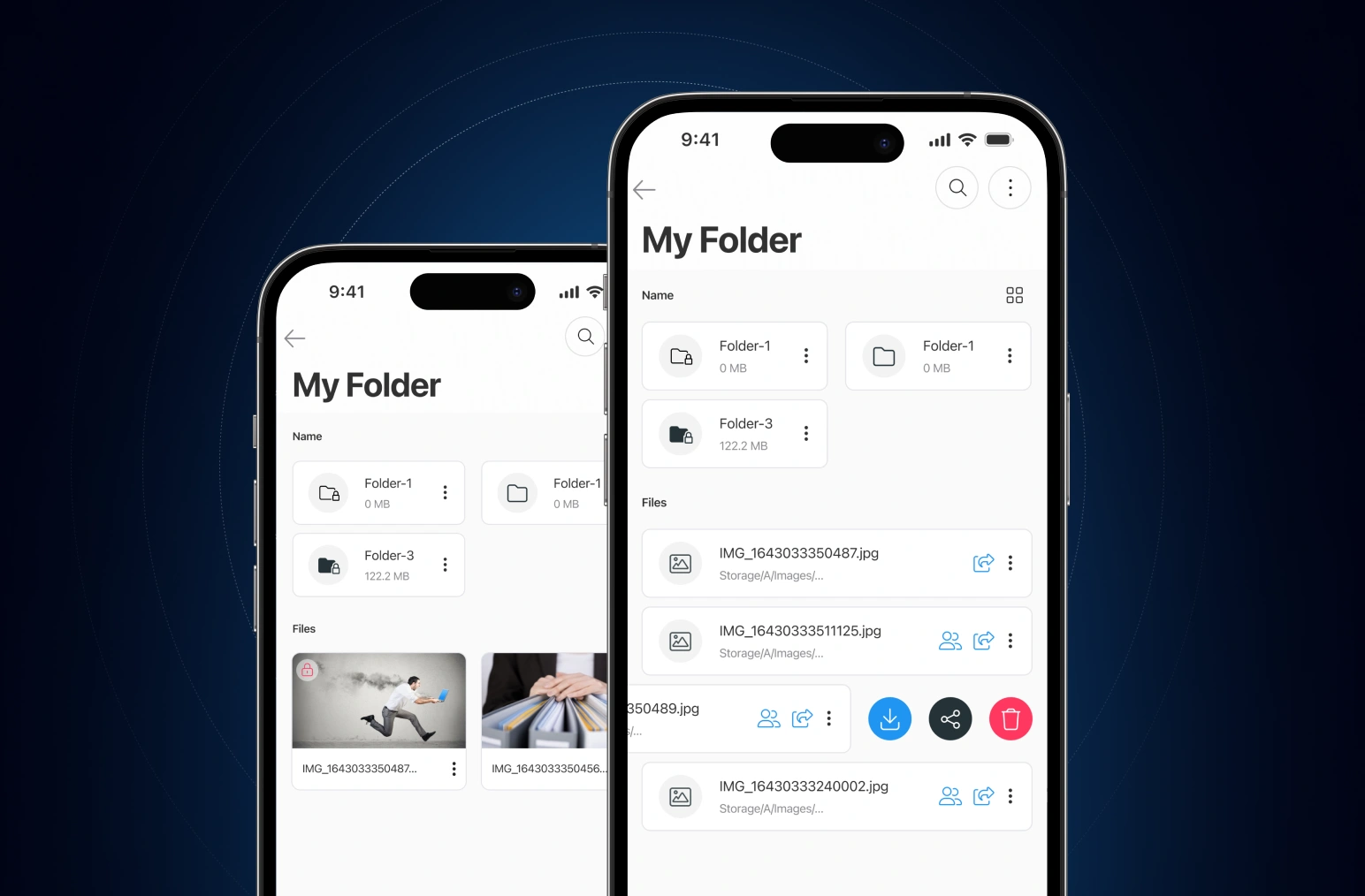
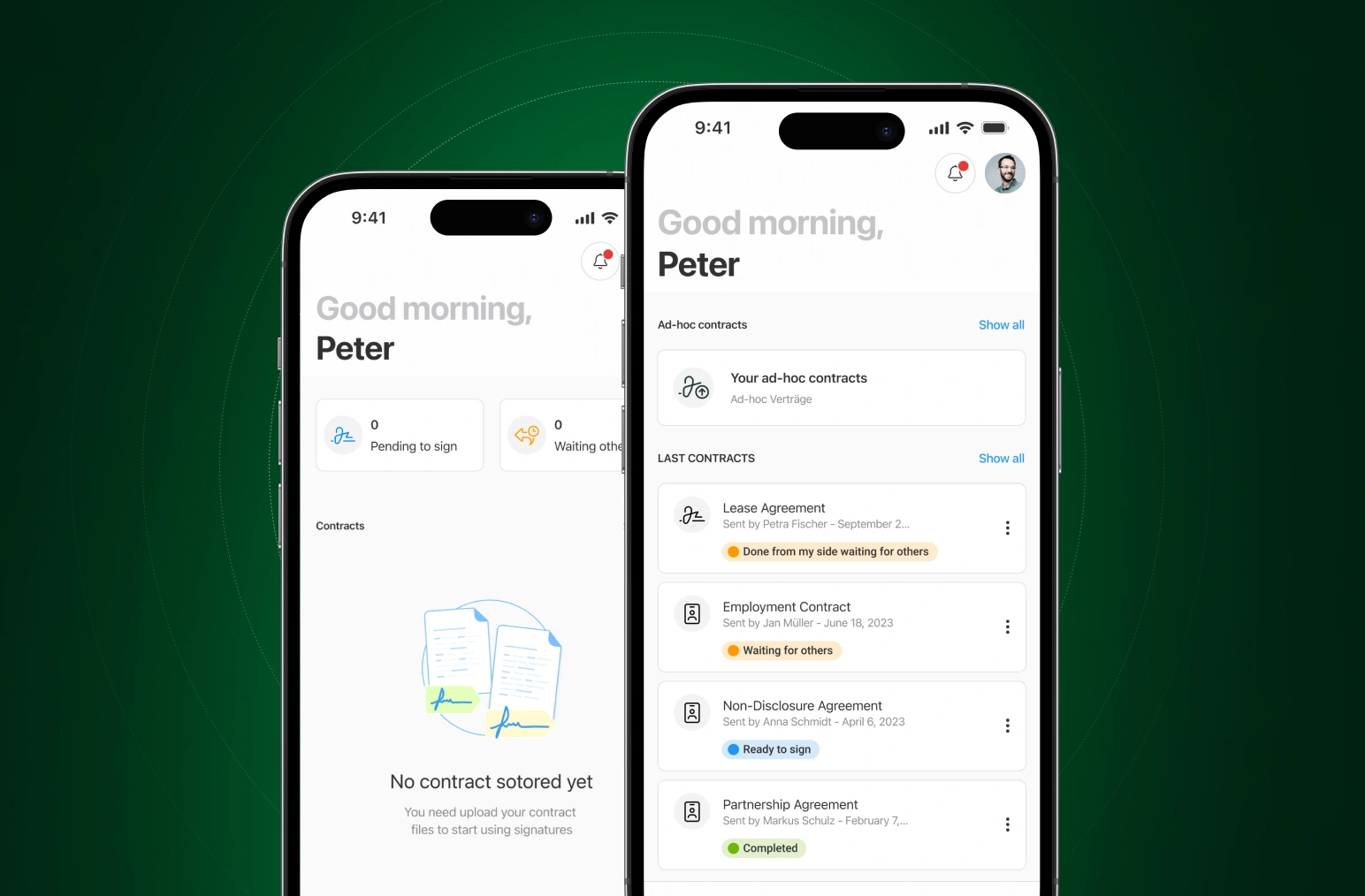
EasyPermit is an app that allows the search and management of public administration permits in different cities of the United States of America. The app is the core product of the company Easy Permit USA founded in 2021, the initial idea focused on connecting permit runners and cities, eventually, investigation and surveys unveiled a more pressing challenge: public information access being difficult or non-existent. At that moment our idea took a more holistic approach, we decided to become the leading platform for Public Building Permits Information Access, and here we are, creating the tools that will enable us to make our vision a reality.
Currently, we are creating a standard for the customer experience Cities provide to their users, and we settle for nothing less than Amazing, to achieve this goal we created our flag product, our mobile application, providing a secure and reliable communication channel, enabling users to find public information fast and easy and allowing cities to reach their community in real-time, with no effort and no cost.
The Challenge
In the process of finding a permit and managing all its information (status, alerts, reports, statistics, warnings, evaluations, etc.) was the challenge that the startup EasyPermits set itself. Its founding team had tested and validated its services for years in a face-to-face and non-automated way, and they were ready to make the leap into the digital world.
After successful pilot tests, they saw potential in building an app, which would allow their team to provide rich content and an automated onboarding experience for end users.
Defining the scope
An important skill for any freelance designer is to know how to scope out a project and then the ability to keep within the scope. I kicked off this collaboration by flushing out what their specific needs were and estimating my time to find a solution. We regrouped over a slack call and once everyone was aligned began the fun stuff: design exploration.
The Discovery
proccess
The discovery phase was a quick, high-intensity effort that allowed us to define project milestones, audit the existing work, review the competitor landscape, understand our client’s vision, and begin research into user needs, behaviours and pain points. We also kicked off a technical discovery phase to understand feasibility and constraints.
Our research revealed that the concept of “cities permits” represented something different to users of the scheme. Users motivations for obtaining a permit in a city and participating in the scheme differed, hinting at different requirements.
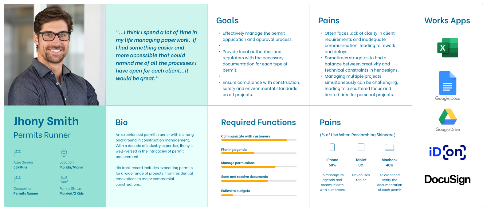
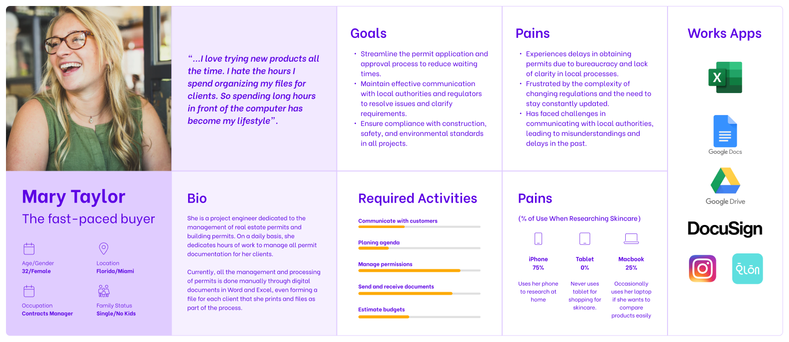
After designating persona types and aligning this with our phasing strategy we were able to prioritise who we would be focusing on supporting in the early stages. The phase 1 app focused on supporting the goals of Mary and Jhony, our primary personas. We planned for later phases to support Natalie, Carla & Alejandro and Chris.
We used personas constantly throughout the project to guide design decisions, priorities, and create empathy amongst the client and our team.
The persona
Our persona hypothesis consisted of five different archetypes which we used to facilitate discussions about our users needs, desires and varying contexts of use. Through careful analysis of our research, we identified sufficient behavioural variables to segment our user audience. These variables could be categorised into activities such as the necessary knowledge of the process to obtain a permit in a city, the frequency of use of the service, and motivations or reasons for getting city permits. We discussed the personas with our client to develop a clear picture of who the design of the app would target in phase 1 and later in future releases.
Designing
for what users
want to know,
do & feel
Extracting Requirements with Mental Models
Going through our research and brainstorming the different things that people do before, during and after getting a building permit in a city, allowed me to come up with a broad set of tasks, quickly. I categorised and segmented the tasks into behavioural affinities and aligned content and features. This gave me a way to visualise what existing functionality and content would be useful, what tasks needed supporting, what opportunities were available to innovate and also what could be discarded from the existing app. Afterwards, I entered all the ideas into a spreadsheet and prioritised them against our personas needs, tech feasibility, and business objectives. This informed our phasing strategy for the app, the product feature roadmap and the product backlog.
Synthesising goals from our research served as a lens through which we could consider not only what the app should do, but also how it should feel. We believed this would be the difference between delivering a good experience and a great one.
Thinking about emotional design early on helped our client understand the importance of aesthetics and tone of voice to the experience.
The Model
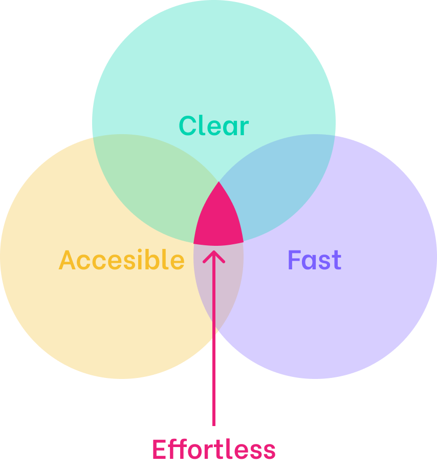
It was clear that the we should focus on making the experience more “effortless”. To make it feel more effortless, we focused on 3 things: speed, clarity and accessibility.We drilled into each attribute with specific ways it could manifest in the product experience. This really clicked with the team and helped everyone understand what the strategy meant and what we needed to do next.
"...To make it feel more effortless, we focused on 3 things: speed, clarity and accessibility."
The process
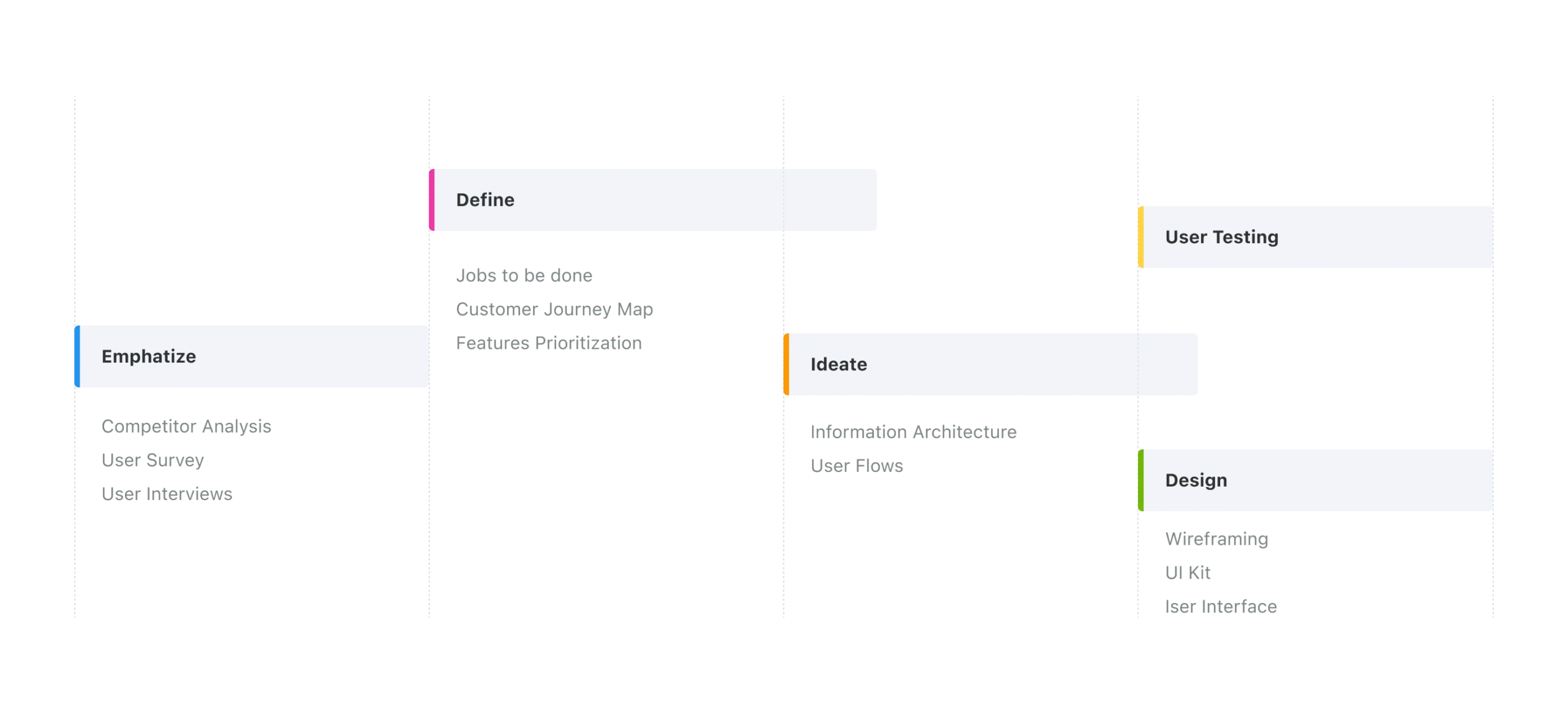
By conducting our product audit during the previous stages of the investigation, we found many areas for improvement. Much of the difficulty was understanding the app at a basic level. There were many “features” to analyze and their conceptual metaphors were inconsistent and confusing, which made it difficult to approach the development process without a solid vision of “how to structure the process”. For this reason, we divided it into three phases:
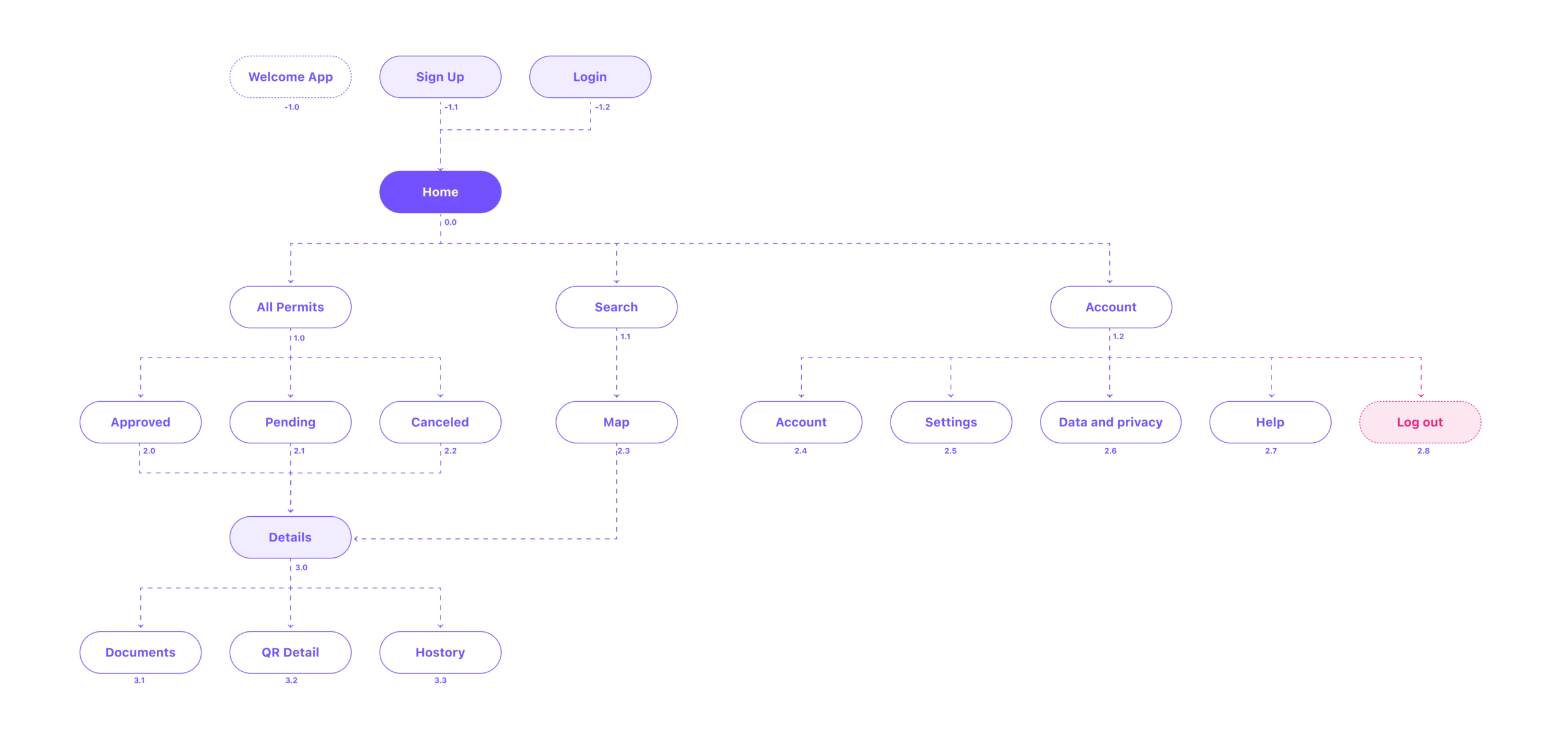
The architecture
Once our client approved the content and functionality to roll‐out in the app, I could start to structure that content. I used Jesse James Garrett’s Visual Vocabulary to represent the architecture of the app. Adopting a numbering system early was beneficial helping our team stay in sync.
Creating a brand concept
One of the key tasks given to me by the Easypermit team was to create a brand for the app. It was a great responsibility, but at the same time a great motivation, because rarely does one as a UX/UI designer have the opportunity to create a complete product, from “the brand” to the modeling of the interfaces.
The concept
To develop the visual concept of the brand, we started from the idea of reflecting in a symbol the three fundamental concepts that focus the business logic of the brand: “EASY” + “PERMIT” + “MAP SEARCH”. Somehow we wanted to synthesize these three concepts in a single brand symbol.
With these three concepts we began to play, in the formal search for different graphic elements (shapes and fonts) with which to build our brand:
Building the logo concept
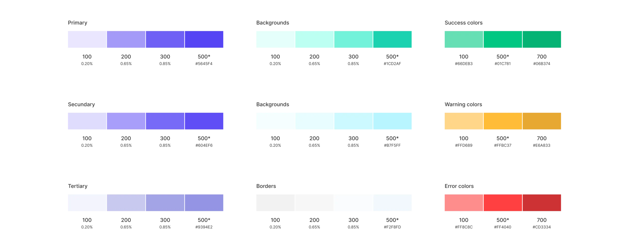
Colors styles
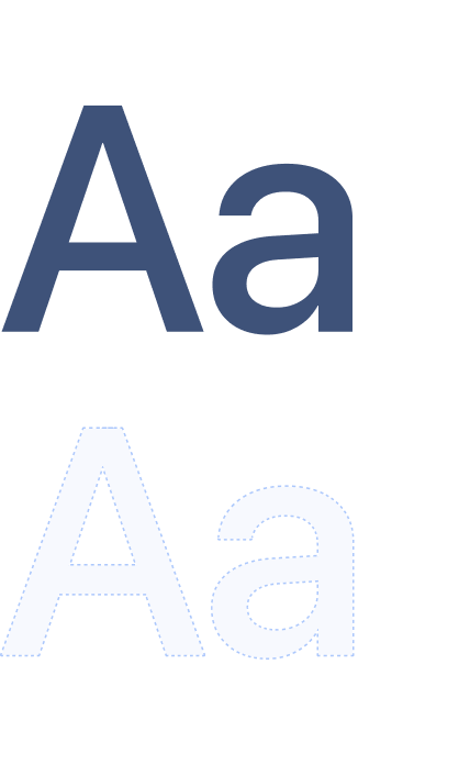
Typography
SFpro
The SF Pro typeface refers to the font family developed by Apple Inc. for its iOS operating system and other Apple products. These fonts are widely used on Apple devices such as the iPhone, iPad, and Mac, as well as in applications and websites related to Apple.
SF Pro is a modern and elegant typeface designed to provide excellent legibility on high-resolution screens, such as those found on Apple devices. The SF Pro font family includes various weights and styles, including Regular, Bold, Light, Ultralight, Italic, etc., allowing designers and developers to choose the variant that best suits their design needs.
SF Pro has become a popular choice for user interface design in mobile applications and websites, especially within the Apple ecosystem. It’s a highly recognizable font and is designed to work well on both small and large screens, making it suitable for a variety of graphic design and user experience design applications.
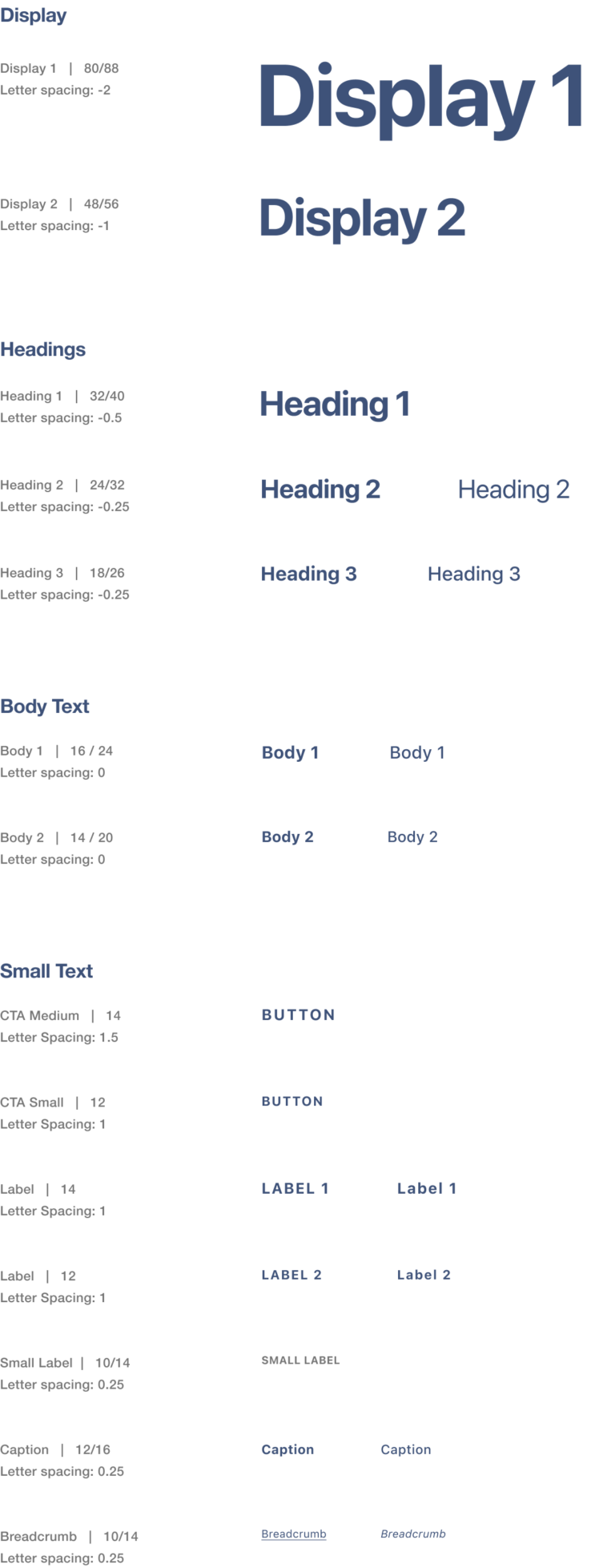
Styles scale
Sketching
the app
We took a top‐down approach to defining the overall structure of the experience. Sketching and storyboarding, I generated stacks of ideas about the arrangement of UI, functional and data elements, and interactive behaviours. Starting broad, our vision began evolving into something tangible. A high‐level design language, interactions and the app’s anatomy began to piece together.
Wireframes
In the initial sketches we made several content distribution tests simply by drawing and laying out the different UIs and their interrelation.
The main advantage that we found in the use of wireframes was to be able to visualize different ways to structure the visuality of the app in a quick and simple way, to start working on the final file from a solid and functional base.
Low-level sketches
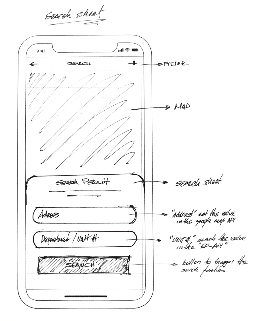
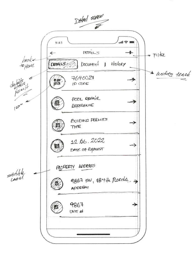
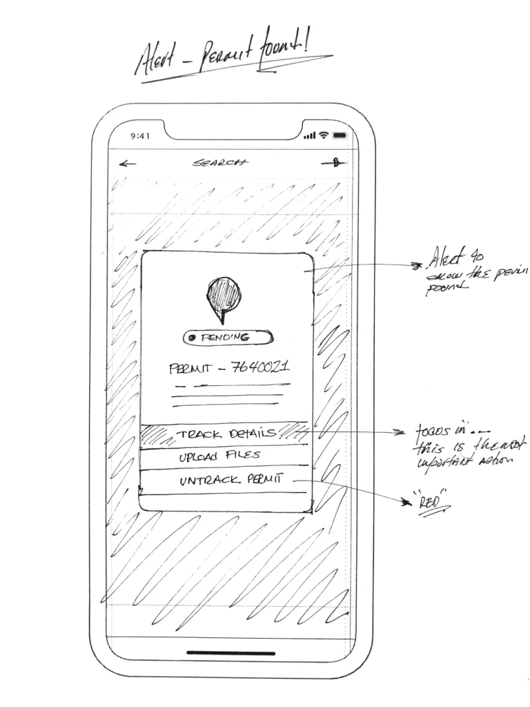
High-level sketching process
High-level sketching
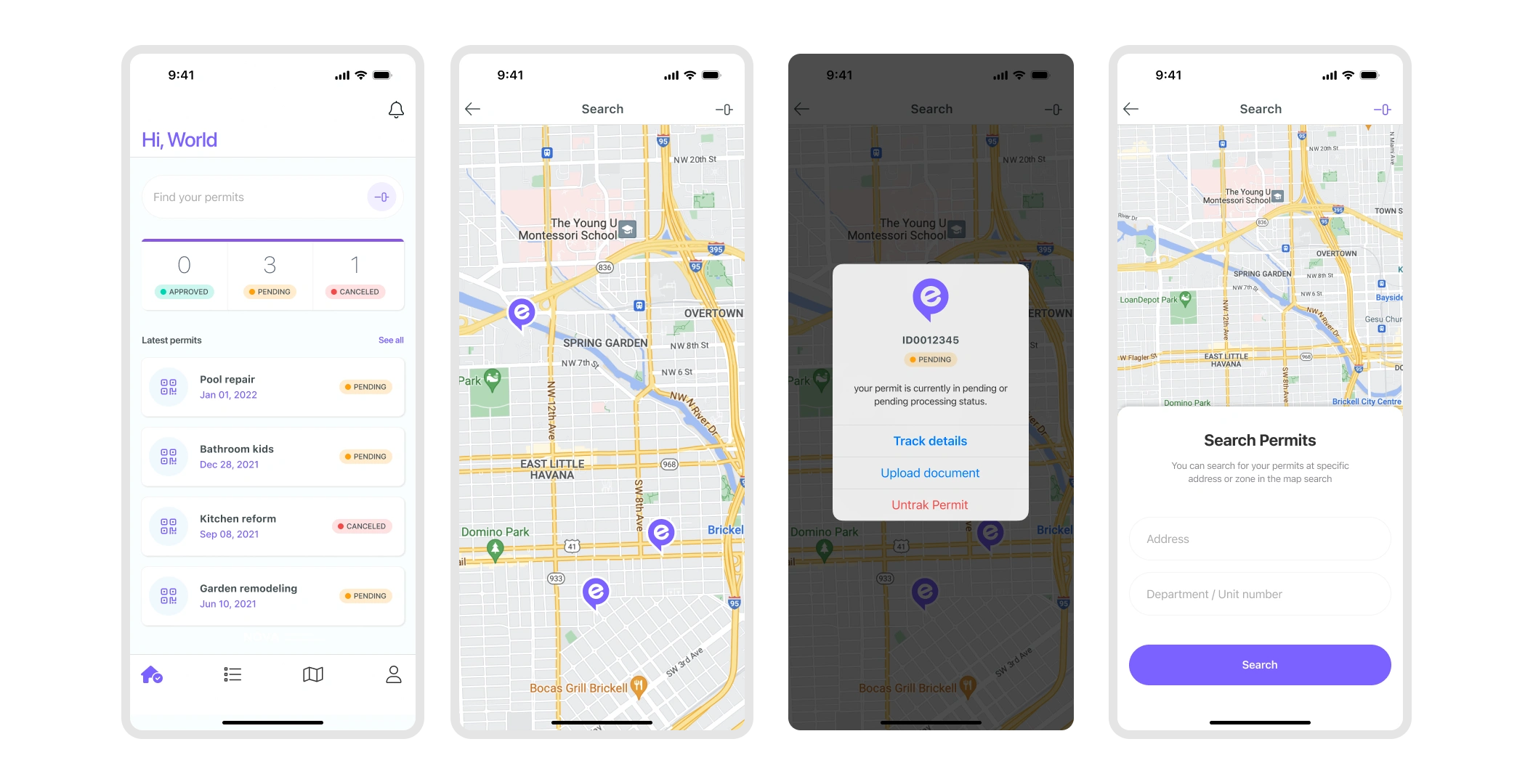

The impact
In a few months we designed the EasyPermit product on iOS, Android and desktop. We stick to our principles and focus on our strategy of making the experience easier (clear + fast + accessible).
During this time, we also focused on aligning the design principles of the company with the digital products we were creating, the idea was to make it feel more modern and reliable with a new brand identity system that differentiates it in the market.