Refactoring the FDS Design System
Client
Firstdue
Date
Jun 2023
My Role
Design System Lead
Team
Marcel Fernandez – Head of Design
- Grisel Valdivia – Product Designer
Adriana Tomey – Product Designer
- Valery Viktorovsky – System Architect
- Ricardo Coviella – Frontend Dev
- Carlos Quintas – Frontend Dev
Technologies
Figma
- Zeroheight
© 2024. Firstdue. All rights reserved. This product and its content are the exclusive property of Locality Media, Inc. Any reproduction, distribution, or use of it without the prior explicit consent of Locality Media, Inc. is strictly prohibited.
Project background
A year ago, I joined Firstdue as a consultant and design system lead to develop a comprehensive design system. Firstdue is a SaaS platform essential for fire departments and emergency systems across the United States, providing critical tools for incident management, resource allocation, and reporting. Designing a design system here was not just about creating a set of components to implement functional and visually appealing interfaces; it was about ensuring it was reliable, accessible, and adaptable, given the sensitive nature of our users’ work.
Embarking on this journey required a balance between innovation and pragmatism. Throughout the year, I worked closely with a specialized team and frontend engineers to ensure that every component and pattern was practical, scalable, and, most importantly, addressed the critical needs of users operating in emergency situations.
My Role
As the Design System Lead at Firstdue, my role extended far beyond the visual creation of components. I was responsible for envisioning, planning, and executing a comprehensive design system that would cater to the unique needs of emergency responders and support their high-stakes work environment. This meant balancing user-centered design with technical feasibility, ensuring that the system not only looked cohesive but was also robust, scalable, and accessible. I worked closely with both design and engineering teams to establish consistent standards, document best practices, and streamline the workflow, making sure each component met rigorous usability and accessibility standards.
The project scope
The design system project for Firstdue was completed in a record time of just 8 months, successfully meeting new requirements focused on accessibility and adaptability to ensure optimal interfaces across all devices. Design tokens based on Figma variables were implemented, enabling centralized and consistent control of visual and thematic styles. Additionally, comprehensive design system documentation was developed using the ZeroHeight platform, providing design and development teams with a detailed and accessible guide to ensure proper implementation and future scalability of the system.
"...Before designing a single line, we need to understand the user’s needs, so we can shape the product to help meet them.”
Before Opening Figma
Auditing the Product and Understanding User Needs
My first step was an in-depth product audit. Unlike other projects, creating a design system for Firstdue demanded a deep understanding of the specific challenges faced in emergency environments. This involved interviews with firefighters and emergency personnel to understand how they interact with the platform under high-pressure situations and how we could optimize their experience.
Inventory of Existing UI and Initial Challenges
I analyzed the existing components and patterns, finding several inconsistencies. There were disparities in component structures, missing states, and accessibility gaps. It became evident that a strong foundation was necessary for visual and functional coherence across the platform.
Key Objectives
1. Establish a Scalable Component Structure: Create a design architecture where components could evolve and be reused across various modules of the platform.
2. Accessibility as a Foundation: Given Firstdue’s use case, accessibility wasn’t optional; it was a standard. We ensured all components adhered to WCAG guidelines.
3. Visual and Functional Consistency: The interface had to be clear, predictable, and familiar for users who might often be in high-stress scenarios.
4. Efficient Collaboration between Design and Development: Develop a workflow in which the development team could implement components quickly while maintaining continuous alignment with the design team.

Organizing the
Design System
Our design system is structured into three core levels: Foundations, Components, and Patterns. This modular architecture streamlines collaboration, ensures visual and functional consistency, and enhances accessibility for both designers and developers. Leveraging tools like Figma, Storybook, and Zeroheight, we established a seamless integration between documentation and technical implementation.
Foundations: the foundations layer serves as the backbone of the design system, defining essential elements such as colors, typography, spacing, shadows, and containers. These principles are critical for building a cohesive design language that works effectively across both light and dark modes, ensuring accessibility in various environments, including high-pressure emergency scenarios. By establishing these core guidelines, we created a “single source of truth” that reduces ambiguity, accelerates decision-making, and aligns designers and developers.
Components: are the reusable building blocks of the system, encompassing elements like buttons, inputs, dropdowns, modals, and more. Each component is designed to be scalable, accessible, and optimized for reuse. Advanced features such as auto-layout and Boolean properties in Figma enable rapid adjustments without sacrificing structure or usability. This modular approach not only sped up the design process but also ensured a seamless transition from design to development, guaranteeing that what was designed precisely matched what was built.
Patterns: are pre-configured combinations of components tailored to address specific use cases within the platform. For instance, in the context of emergency response teams, we developed patterns for practical solutions such as alert modules, notification banners, and incident report forms. These patterns are designed to deliver critical information clearly and enable swift actions in high-pressure situations. By grouping commonly used components, we reduced redundancy and provided a consistent, tested toolkit for managing critical workflows, ensuring users could navigate with confidence under stress.
Connecting the Layers
The design system is documented in Zeroheight, where the Foundations, Components, and Patterns are centralized for clear and structured access. Design and development teams use Figma for visual creation and Storybook for technical implementation, ensuring a seamless workflow from concept to production.
This hierarchical architecture promotes efficient collaboration, enforces consistency, and addresses the unique needs of our platform, providing a robust foundation for scaling design efficiently.

Defining the Foundations
The Foundations of the FDS establish the core principles of consistency, accessibility, and scalability across the platform. The color palette was crafted using tonal interpolation, creating 10-step scales that ensure optimal contrast and functionality for key states like active, inactive, hover, error, and confirmation. Typography was structured using a harmonious scale, ensuring clear hierarchies and seamless integration with a 4-point grid system. These foundational decisions guarantee a consistent design experience across all visual contexts.
Additionally, spacing principles were implemented following an 8-point system, with specific exceptions for smaller elements to provide flexibility and uniformity. Border radii were standardized at 4px and 8px depending on the component, creating a modern and functional aesthetic. Focus rings were designed for accessibility, highlighting active elements with clear contrast in both light and dark modes. This overall approach, supported by well-organized design tokens, ensures a cohesive and adaptable user experience.

Components
The creation of components in the FDS is grounded in principles of scalability, reusability, and accessibility. Each component was meticulously designed to adapt seamlessly across various use cases, maintaining visual and functional consistency. Built on the foundational grid and spacing system, components such as buttons, inputs, dropdowns, and modals were crafted with modularity in mind, ensuring they can be reused and customized without compromising their core structure. This approach streamlines development while preserving design integrity.
Accessibility played a central role in component design, with features like focus states, keyboard navigation support, and clear interaction feedback integrated by default. Components were optimized for responsiveness and performance, leveraging tokenized properties such as color, spacing, and typography to ensure alignment with the broader system foundations. By adhering to these principles, the FDS components provide a flexible and unified framework that simplifies implementation while delivering a consistent user experience across all products.
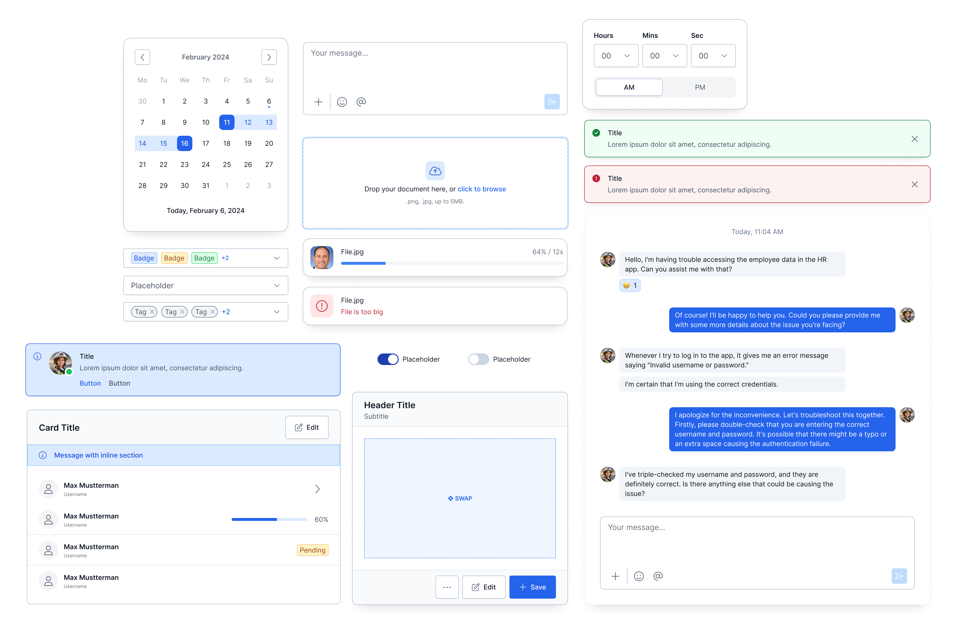
example of some components and patterns implemented in FDS 3.0.
Documentation
Documentation was a cornerstone in the development of the FDS design system. We chose to centralize all information in Zeroheight, which allowed us to consolidate both visual definitions and technical implementations in one place. This ensured that the design and development teams had a single source of truth, keeping everyone aligned and fostering seamless collaboration throughout the project.
A key factor in the success of this approach was the integration of tools like Storybook and Figma within Zeroheight. This strategy brought together the designers’ visual perspective and the developers’ technical insights in a unified space.
The documented components included detailed specifications, interactive code examples, and visual prototypes, streamlining both the design and implementation processes. This integration provided teams with a deeper understanding of how components functioned in real-world product contexts, reducing misunderstandings and redundancies. The documentation was not just a practical resource but also a vital bridge between design and development, establishing a solid foundation for the success of the design system.
"Centralized documentation was the cornerstone of FDS, enabling seamless collaboration between designers and developers..."
Sample video of the Zeroheight documentation platform.
Lessons Learned
& Best Practices
For me, developing FDS as the Design System Lead was an incredible experience and an extraordinary challenge. Leading the design team on this project pushed me to face unique obstacles, but it also allowed me to learn and grow in ways I hadn’t anticipated. One of the biggest takeaways for me is that accessibility can’t be an afterthought. It has to be embedded in the DNA of the system from day one to ensure that what we create works for everyone.
I also realized how crucial documentation is. Having a single source of truth not only keeps designers and developers aligned but also enables much smoother collaboration. Another major learning was finding the balance between standardization and flexibility: designing components that are consistent and scalable while still being adaptable to future product needs. And, of course, never losing sight of the user. Empathy and understanding their needs were key to ensuring everything we built made a real, positive impact. This project wasn’t just a technical success—it was an experience that left me with invaluable lessons for any challenge ahead.