novacshealth
Client
Novacshealth Corp.
Date
Apr 2022
My Role
UX/UI Product Designer
Team
Andreu Bernard – Front-End Developer
Michael Davis – Back-End Developer
Jessica Wilson – Quality Assurance (QA) Specialist
Kevin Miller – Scrum Master
Hannah Taylor – Interaction Designer (UI)
Robert Anderson – Business Analyst
Ravi Patel – Mobile Developer (iOS)
Ethan Moore – Mobile Developer (Android)
Technologies
Figma
- Adobe Illustrator
- Adobe After Effects
© 202 Novacshealth Corp. All rights reserved. This product and its content are the exclusive property of Novacshealth Corp. Any reproduction, distribution, or use of it without the prior explicit consent of Novacshealth Corp. is strictly prohibited.
Project background
NovacsHealth was born out of the vision of Beatriz Diaz and Jannet Diaz, two entrepreneurial sisters in the medical industry in South Florida, USA, who realized that the healthcare system needed a transformation. Initially, they thought of a clinic, but after researching and talking to the community, they discovered that health data management was a real challenge. They decided to pivot and focus on providing patients with an easier way to access and control their medical information.
The goal these entrepreneurs wanted to achieve was to create an application that would not only make it easier to access their patients’ medical information, but also allow patients to schedule appointments, keep track of their appointments and prescriptions, and be in total control of their health.
My role
My role on this team focused on the strategy and design of the mobile application and web platform that allow patients to manage their health data, medical appointments, consultations, prescriptions and more.
The Challenge
The main challenge we faced was to bring healthcare data management into the digital world. The foundation of NovacsHealth was in face-to-face, non-automated healthcare, so we had to translate that experience into an intuitive and “easy-to-use” application.
Defining the scope
The first crucial step was to define the scope of the project. We worked closely with the NovacsHealth team to understand their specific needs and estimate the time required to find solutions. Once we were all aligned, we began to explore and dive deeper and deeper into the exciting world of design.
"...transforming health management by digitizing medical data so that patients can control their information, schedule appointments, and manage their treatments in an intuitive and accessible way with the NovacsHealth app."
The research process
During the research phase, we identified numerous areas for improvement in the existing application. One of the primary challenges was grasping the application at a basic level. There were many “features” to analyze, and their conceptual metaphors were inconsistent and confusing. This complexity made the development process intricate. For this reason, we divided the project into phases.
To address these issues, we chose to implement the Design Thinking methodology. This decision was rooted in the need for a holistic, user-centered approach, allowing us to thoroughly understand the experiences, needs, and expectations of end-users. Here are the fundamental reasons why we opted for Design Thinking:
User Empathy: Design Thinking places a strong emphasis on understanding user needs and emotions. Through interviews, observation, and empathy, we gained valuable insights that informed design decisions. This was crucial for addressing the inconsistencies and confusions identified during the research phase.
Continuous Iteration: The Design Thinking methodology encourages continuous iteration. This feature was crucial for our project, enabling us to adapt and improve the design constantly as new discoveries emerged during the development phases. The ability to adjust and refine based on feedback was essential for overcoming the challenges in understanding the application.
Collaborative Approach: Design Thinking fosters multidisciplinary collaboration. The diversity of perspectives within the team, including designers, developers, and user experience experts, enriched creativity and ensured a comprehensive solution. Effective collaboration was crucial for addressing the multiple layers of complexity identified in the existing application.
Practical Solution Orientation: Design Thinking focuses on action and implementing practical solutions. This was essential for our project, as we were not just looking to identify problems but also to provide tangible and effective solutions. The methodology allowed us to define and prototype iteratively, moving us closer to a more understandable and user-friendly application.
In summary, we chose Design Thinking because it offers a systematic, user-centered approach to addressing the challenges identified during the research phase. This methodology allowed for a deep understanding of user needs and facilitated the creation of iterative, pragmatic solutions, paving the way toward a more coherent and user-friendly application.
"...we chose Design Thinking because it offers a systematic, user-centered approach to dealing with the challenges identified during the research phase."
The Discovery
proccess
The discovery phase was intense and exciting. It allowed us to establish project milestones, audit existing work, analyze the competition, understand our clients’ vision, and conduct research on user needs, behaviors and pain points. We also initiated a technical discovery phase to understand feasibility and constraints.
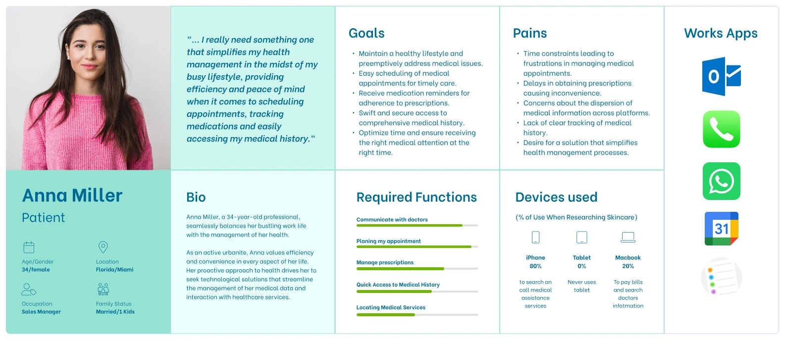
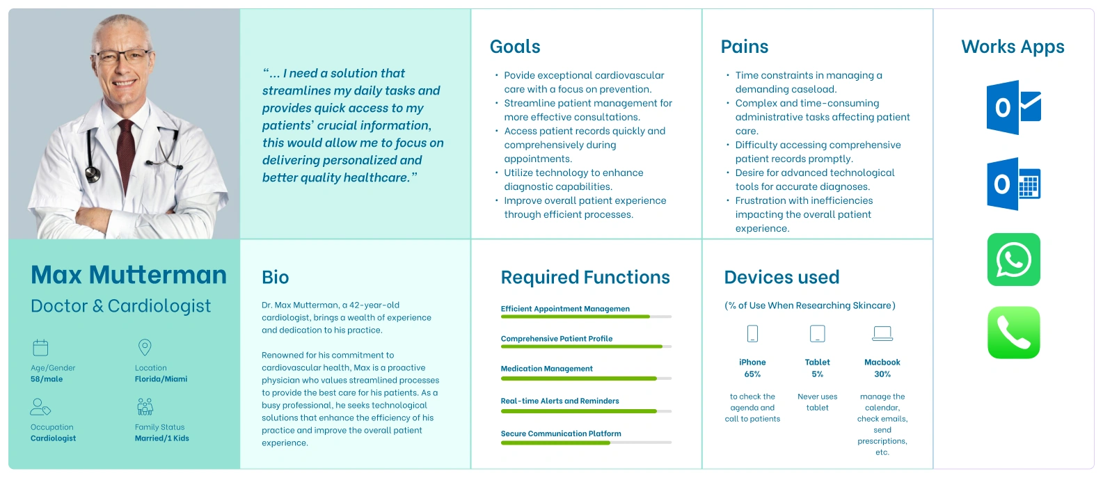
Our research revealed that health data management means different things to users. Their motivations and needs varied, which led us to define several types of personas or “personas.” In phase 1 of the application, we focused on supporting people like Anna (patient rol) and Dr. Max Mutterman (Doctor), our primary personas. We planned that future phases would support other users such as Laura, Carlos involved in other user control flows.
The persona
We created two user archetypes that helped us to better understand the needs, desires and contexts of use of our application. Through a detailed analysis of our research, we identified behavioral variables that allowed us to segment our audience. We discussed these personas with the NovacsHealth team to get a clear picture of who the app would target in phase 1 and future releases.
Designing for
patients' needs
Extracting Requirements
Once we collected a large amount of information, we needed to identify what users wanted to know, do and feel when using the application. To do this, we used mental models and mapped user tasks and needs. This allowed us to prioritize what should be included in the application and what could be left out.
This approach also helped us think about emotional design from the beginning, which involved the aesthetics and tone of voice of the experience. We believed that this aspect would make the difference between a good and a great experience.
The Model
We decided to focus on making the experience “easier“. To achieve this, we focused on three key aspects: speed, clarity and accessibility. We developed specific strategies for each of these aspects, which helped our team understand the vision and what we needed to do next.
"...we decided to focus on making the experience "easier"...
The architecture
The architecture of an application is a crucial aspect for its success and efficiency. When it comes to structuring the content of an application, it’s important to consider various elements. In our case, we used Jesse James Garrett’s Visual Vocabulary, an effective tool for representing the architecture of applications. This approach helps visualize and organize the different layers and components of the application, facilitating the development team’s understanding.
Using Figjam as a diagramming tool is another wise decision. Figjam is an interactive platform that allows teams to collaborate in real-time, creating and sharing diagrams and workflows. By modeling the architecture in Figjam, you not only achieve a clear visual representation of the application’s structure but also facilitate discussion and idea exchange among team members.
The numbering system adopted from the beginning is another strategy worth highlighting. This system helps maintain order and clear reference for each part of the architecture, which is essential for team synchronization and organization. It allows for easy reference and tracking of different parts of the project, facilitating communication and understanding among team members.
In summary, the combination of a structured approach, the use of visualization tools such as Figjam, and a clear numbering system formed a solid basis for the development of the application architecture. This not only improved the efficiency of the development process, but also ensured that all team members were aligned at all times and understood the structure and functionality of the application.
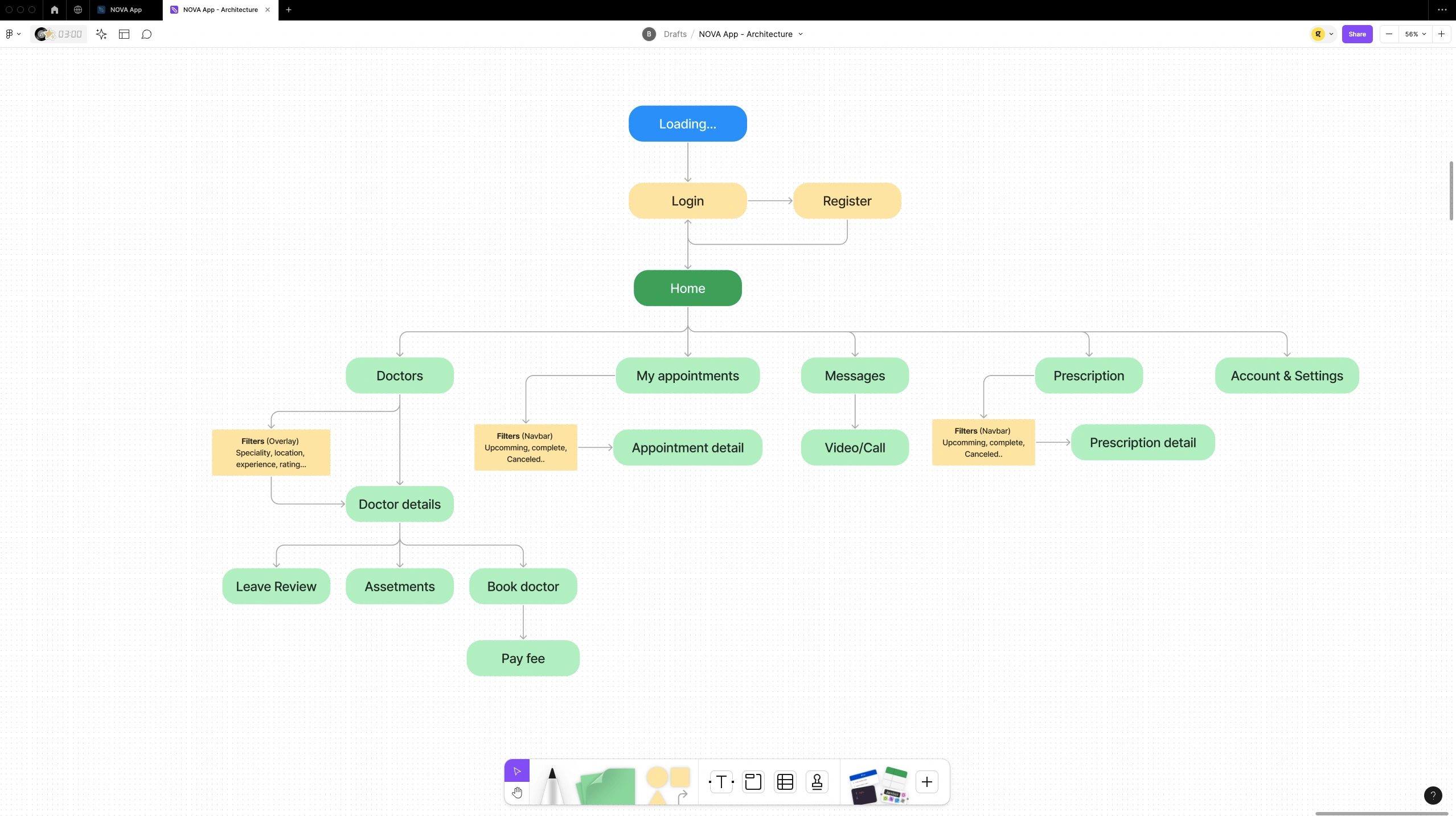
"...we used Jesse James Garrett’s Visual Vocabulary to achieve a clear and organized representation of the different layers and modules of the application."
Brand
concept
design
The logo is the visual essence of a brand, and in the case of NovaHealthcs, our approach has been to create a distinctive and meaningful identity that resonates with medical excellence and the community it serves. When conceptualizing the logo design for NovaHealthcs, we delved into the essence of its name and values to capture the unique spirit of this clinic.
The concept
The central symbol of the logo is a medical cross, symbolizing NovaHealthcs dedication to healthcare and well-being. However, what truly sets this logo apart is the horizontal line with a “n” shape integrated into it. This “n” is not merely a letter; it is an intrinsic element representing the word “nova” from Nova Community Services. This clever detail not only adds a layer of subtlety to the design but also establishes an immediate connection between the clinic’s name and its distinctive symbol.
The “n” shape in the horizontal line is not just a nod to the name “Nova” but also embodies the idea of renewal and growth, reflecting NovaHealthcs commitment to continuous improvement and evolution in healthcare. The choice of the medical cross shape communicates trust and professionalism, underscoring the patient-centered approach and quality of healthcare provided by the clinic.
Logo construction process
Sketching
the app
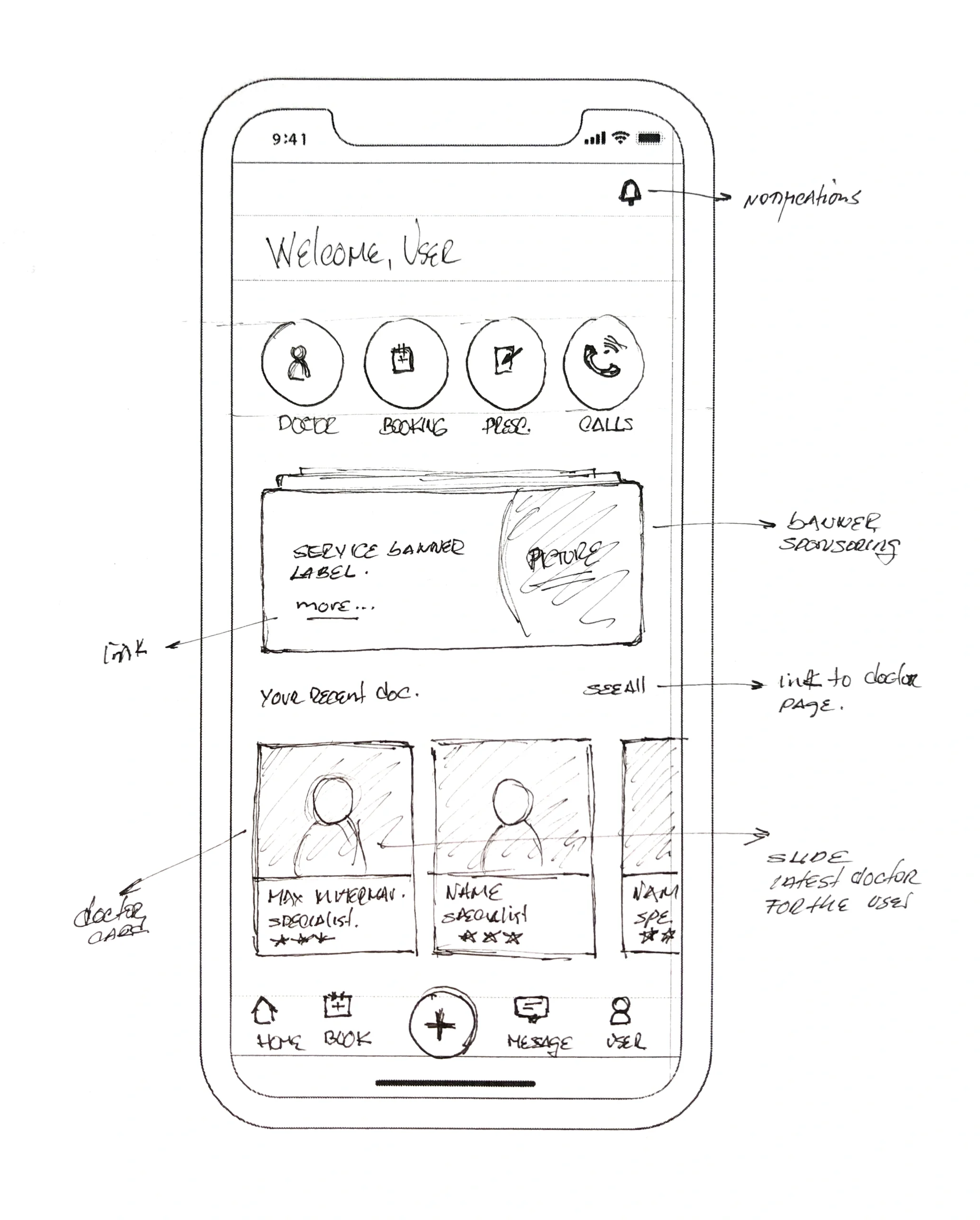
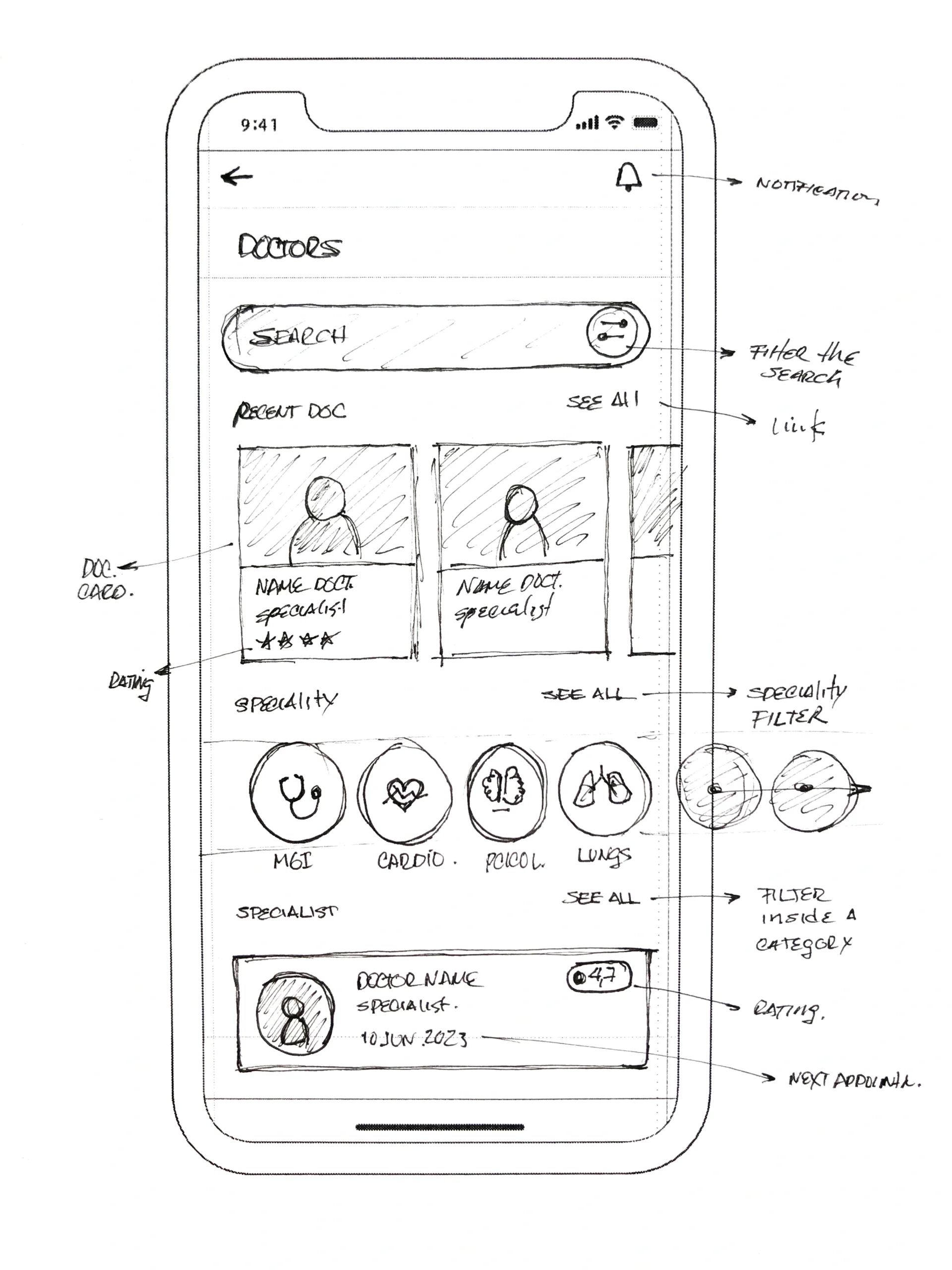
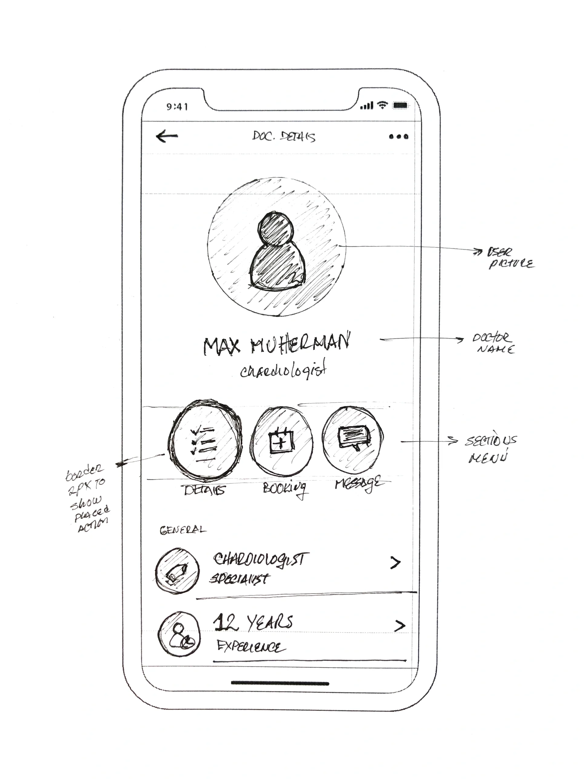
We took a top‐down approach to defining the overall structure of the experience. Sketching and storyboarding, I generated stacks of ideas about the arrangement of UI, functional and data elements, and interactive behaviours. Starting broad, our vision began evolving into something tangible. A high‐level design language, interactions and the app’s anatomy began to piece together.
Wireframes
In the initial sketches we made several content distribution tests simply by drawing and laying out the different UIs and their interrelation.
The main advantage that we found in the use of wireframes was to be able to visualize different ways to structure the visuality of the app in a quick and simple way, to start working on the final file from a solid and functional base.
Low-level sketching

High-level sketching
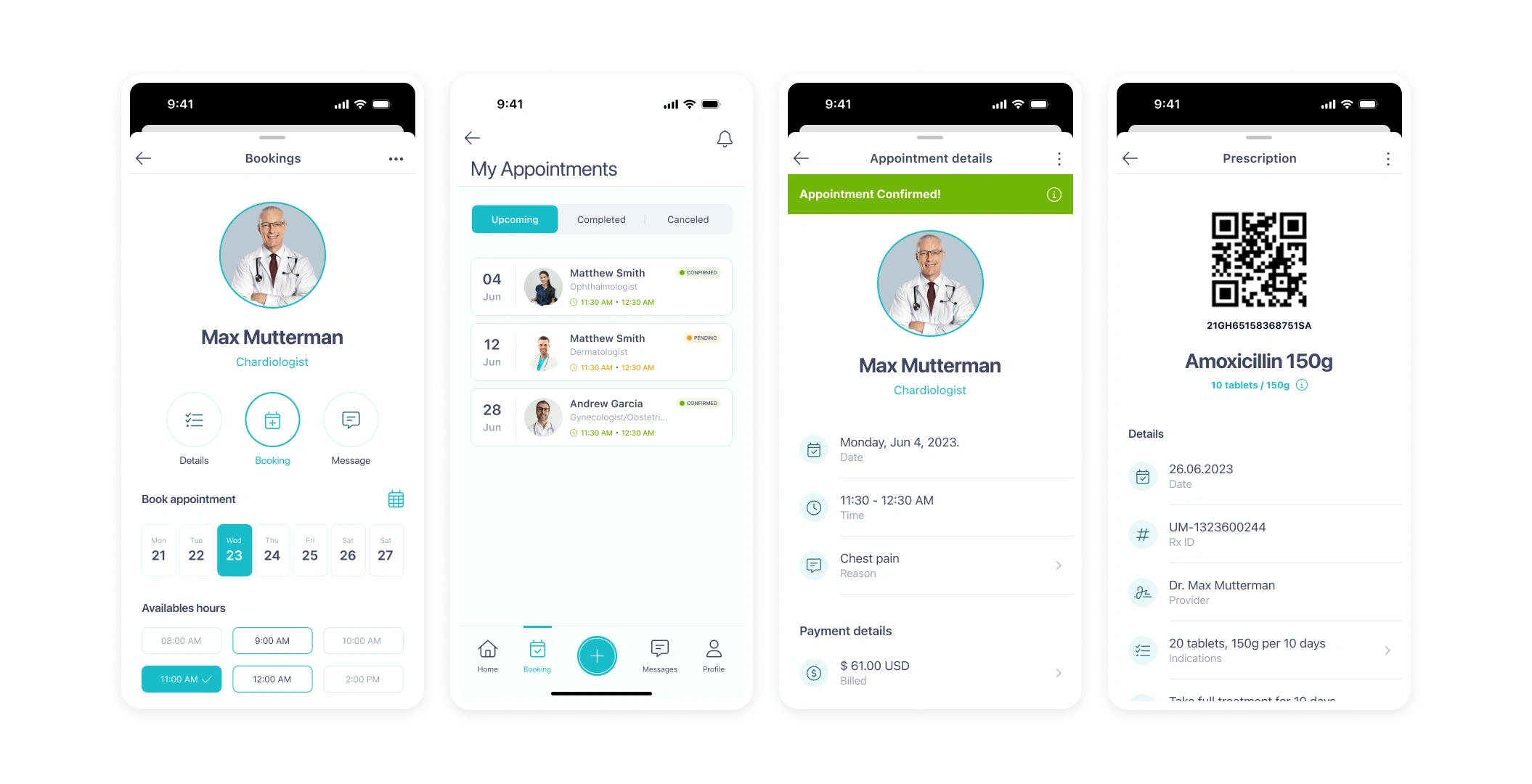
pixel perfect screens design

The impact
In a matter of months, we designed the NovacsHealth app for iOS, Android and desktop. We stuck to our principles and focused on our strategy of making the experience simpler (clear + fast + accessible).
During this time, we also focused on aligning the company’s design principles with the digital products we were creating. The idea was to make the app feel modern and reliable, with a new brand identity system that would differentiate it in the marketplace.
This project was an exciting and challenging journey, and I am proud to have been a part of it. Working with NovacsHealth reminded me of the importance of focusing on user needs and how design can transform the way we interact with healthcare. It was an honor to be part of such a passionate and dedicated team!
