This content is protected
To view, please enter the password.
Nixfarma
Date
2025
Client
Pulso
Sector
Pharmacy Software
Role
Lead Product & UX Designer
Overview
Nixfarma has run pharmacies across Spain and Portugal for almost forty years, from sales and purchases to electronic prescriptions and dashboards. The software worked, but its interface had not been touched in twenty. Pulso brought me and my team in with a clear constraint: improve something thousands of pharmacists depend on every day, without breaking what works.
The challenge
The same platform serves the owner of the pharmacy, the pharmacist at the counter and the technician in the back room, often on screens set into counters, behind glass and in direct sunlight. Every change had to make their work faster and easier to read, without forcing anyone to relearn their job.
My role
As lead product and UX designer I led the redesign from discovery to launch: UX audits and discovery sessions, a focus group with colourblind pharmacists, the new design system and its icons, the dashboards and NixIA, the AI companion that became the face of the launch.
Four people at one counter
A pharmacy is a small team where everyone uses the same software in a different way. In the discovery sessions and UX audits, four profiles stood out: María, the owner, who wants to know how the business is doing even from her phone; Esther, the pharmacist at the counter, serving one patient after another; Diego, the technician who keeps orders and stock under control; and Óscar, a colourblind pharmacist, like those in our focus group, who showed us how much the old interface relied on colour alone. Pick any of them below to see what they wanted, what got in their way and how they worked.
- 52 / Female
- Valencia, Spain
- Pharmacy owner
- Married / 2 kids
- Follow sales, margins and orders at a glance, even from her phone.
- Spot what is not selling before it expires.
- Keep the team fast at the counter.
- Reports that take ages to build.
- Numbers spread across different screens.
- Not knowing how the day went until she is back at the pharmacy.
- Devices
- iPhone 40%, Tablet 10%, Back-office PC 50%
- Apps
- Nixfarma, Excel, WhatsApp, Outlook
- 34 / Female
- Castellón, Spain
- Assistant pharmacist
- Single / No kids
- Serve each patient quickly and without mistakes.
- See interactions and prescription rules before the sale ends.
- Do everything from the keyboard.
- Screens full of colour that mean nothing at a glance.
- Glare on the counter screen.
- Having to remember where each option lives.
- Devices
- Counter PC 90%, iPhone 10%
- Apps
- Nixfarma, WhatsApp
- 27 / Male
- Madrid, Spain
- Pharmacy technician
- Single / No kids
- Keep stock right without overstocking.
- Prepare patient orders on time.
- Order from the right supplier at the right price.
- Suppliers and laboratories hard to find in long lists.
- Orders whose status he cannot see.
- Duplicated work between the robot and the system.
- Devices
- Counter PC 70%, Tablet 20%, iPhone 10%
- Apps
- Nixfarma, Excel, WhatsApp
- 45 / Male
- Seville, Spain
- Pharmacist
- Married / 1 kid
- Understand every state without relying on colour.
- Read the screen in any light.
- Trust a warning at first sight.
- Red and green used as the only signal.
- Low-contrast text behind glass.
- Icons that change meaning from one screen to another.
- Devices
- Counter PC 85%, iPhone 15%
- Apps
- Nixfarma, WhatsApp, Outlook
One map for the whole platform
Nixfarma is a big platform, so before redesigning a single screen I mapped how people move through it: the sales counter, orders and purchases, products and stock, and the dashboards, with NixIA one key away from all of them. Below, a simplified version of that map; tap any module to read what it does.
Designed for a screen behind glass
Pharmacy screens sit inside counters, behind glass and often in direct sunlight. A focus group of colourblind pharmacists showed us how much room there was, so accessibility moved to the centre of the project. We built new colour ramps checked against WCAG 2 and WCAG 3 contrast, and paired Inter for the interface with IBM Plex Mono for product names and figures.
States you can read without colour
Pharmacists juggle dozens of states: an integrated prescription, a product that cannot be substituted, an order sent to the robot, an interaction between medicines. I gave each one its own icon and label, so no state depends on colour alone, and tables show at a glance what is reduced, not funded or still to be dispensed.
Selling at the counter
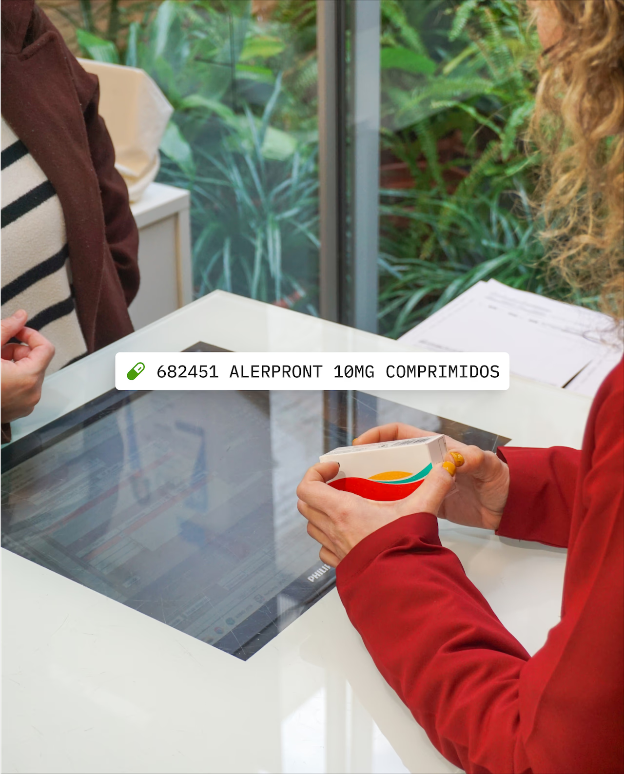
The sales screen is where most of the day happens. Scanning a product fills the line, the patient and their loyalty card stay in view, interactions between medicines are flagged before the sale ends, NixIA is one key away and the card terminal confirms the payment right on the screen.
Dashboards that adapt to each person
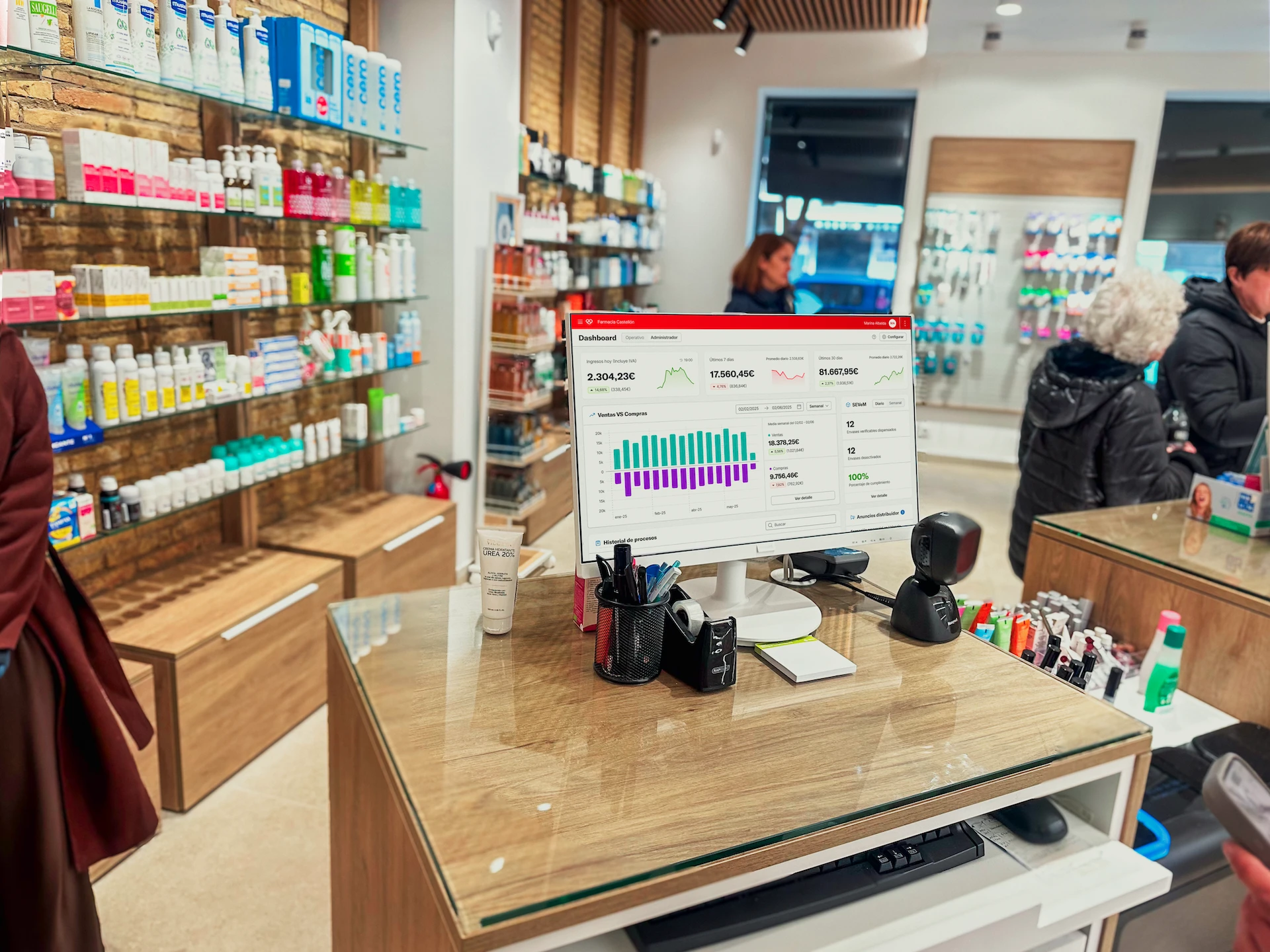
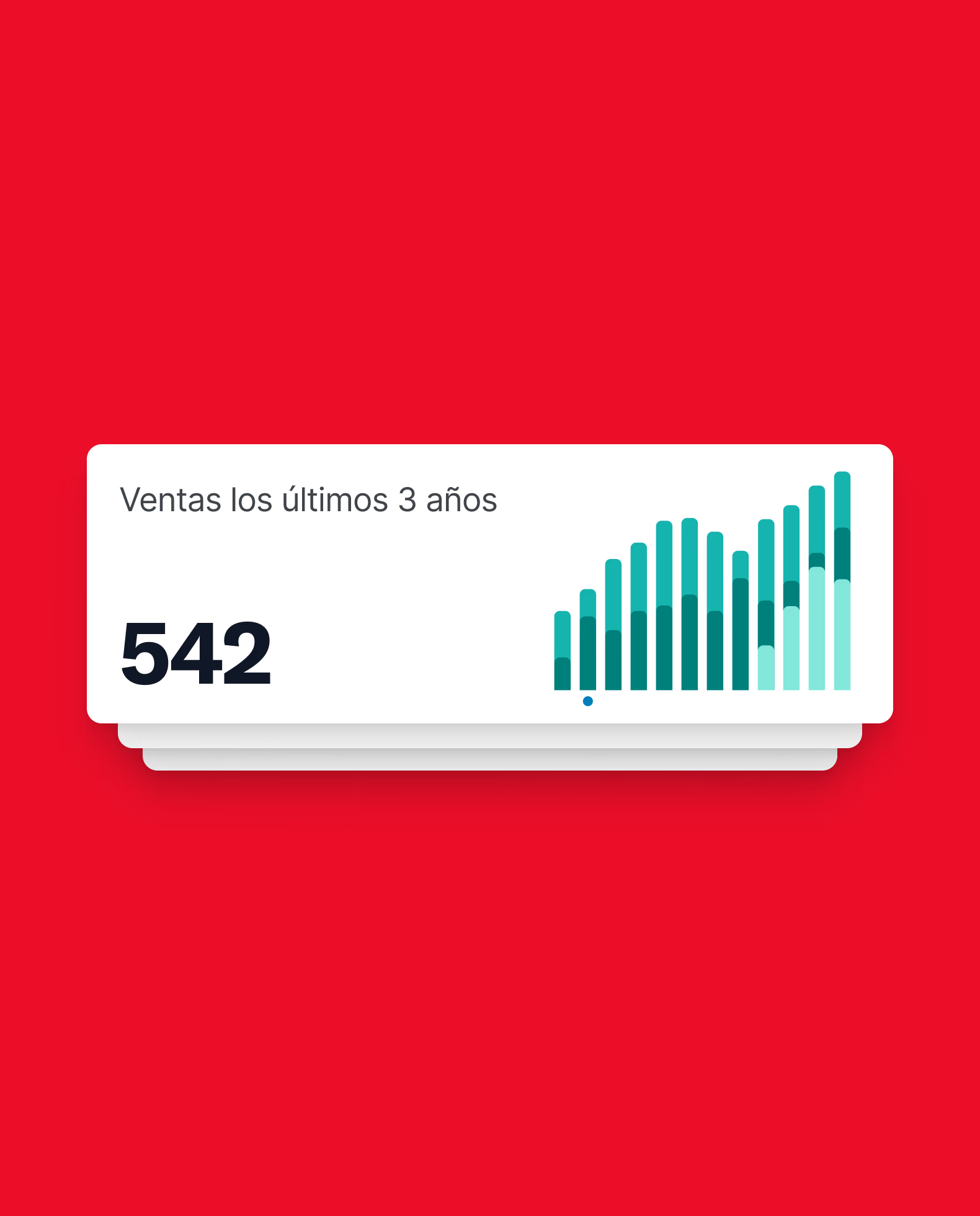
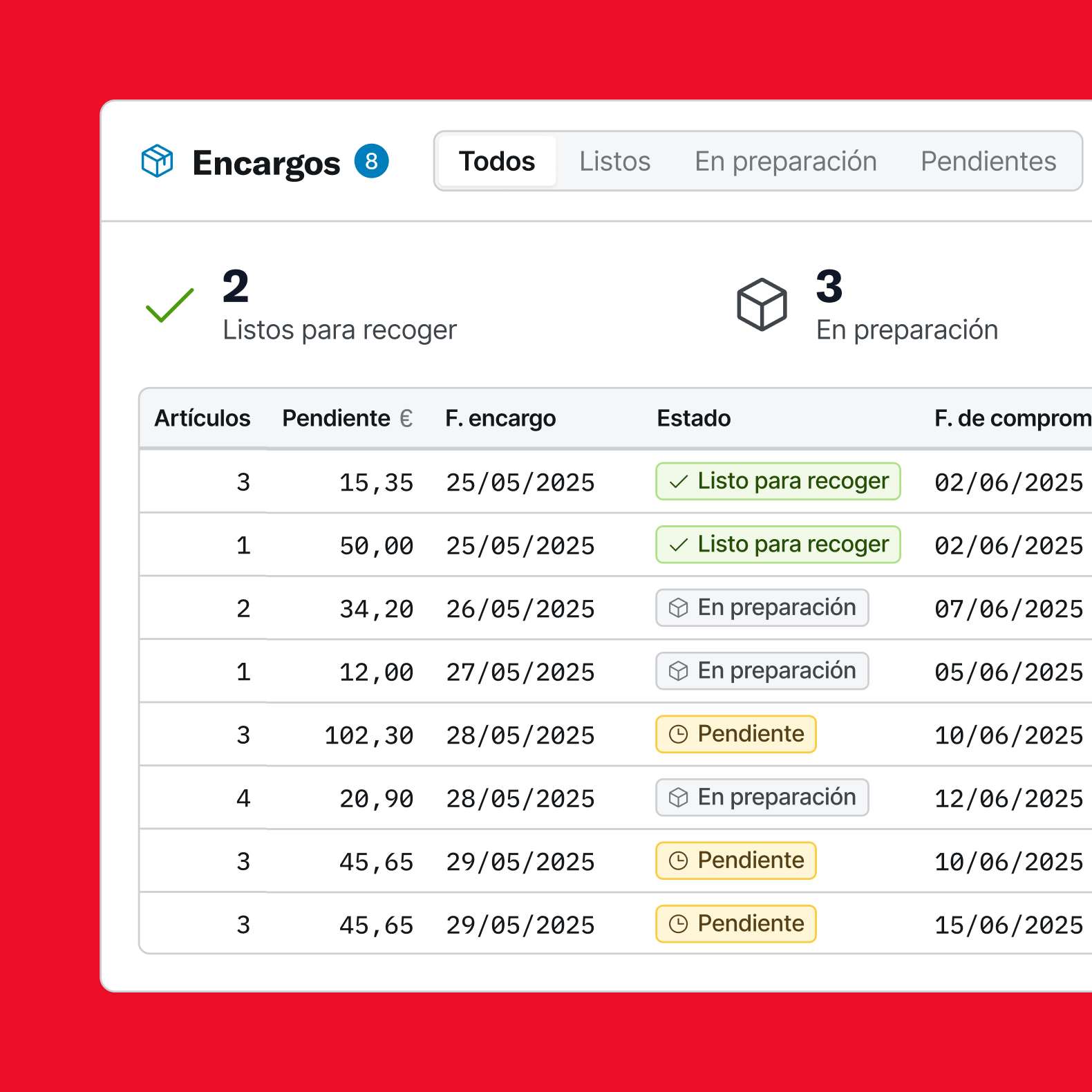
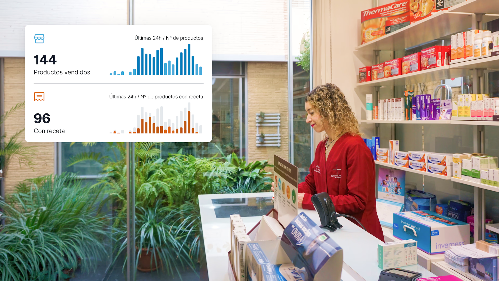
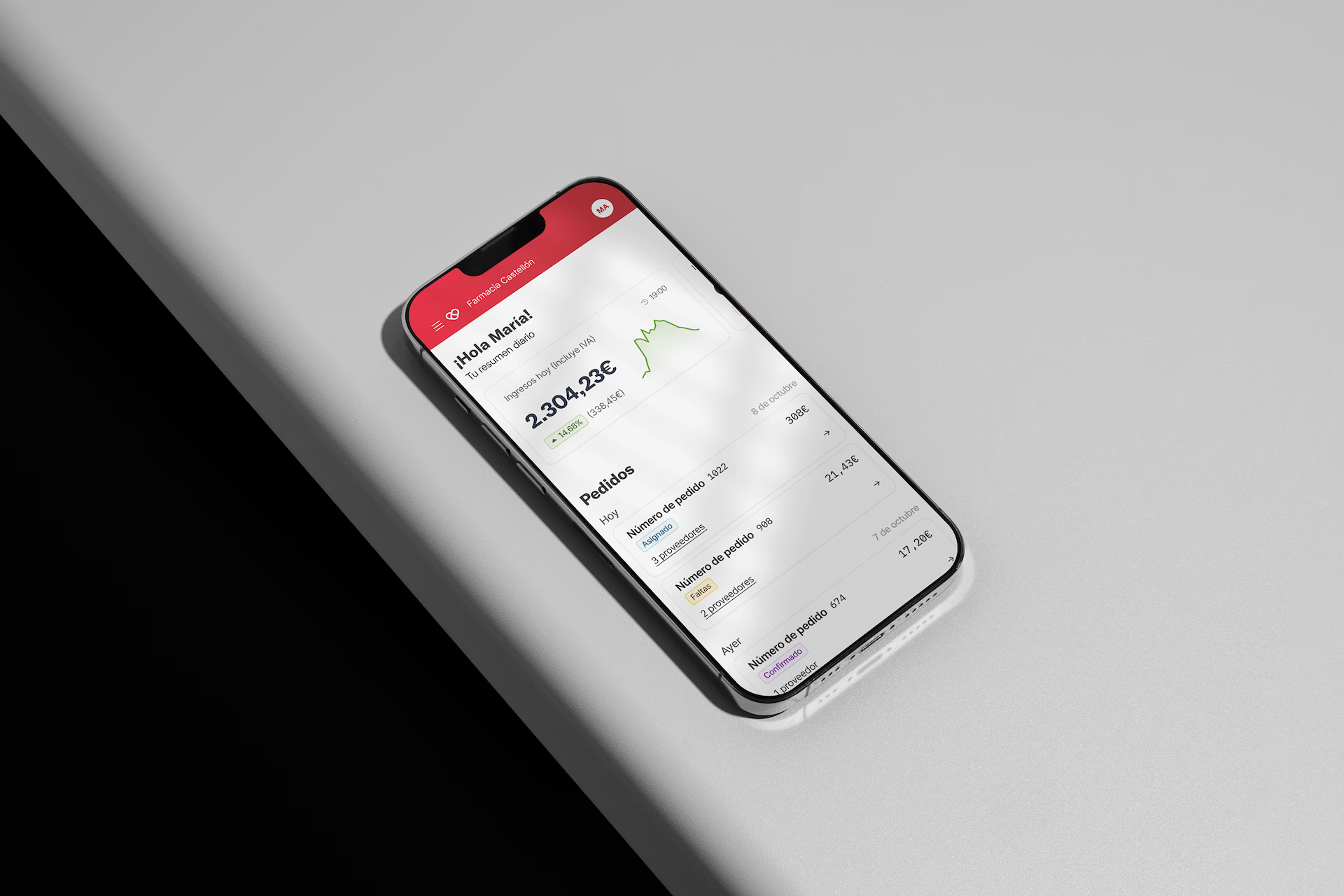
The owner and the team do not need the same numbers. Each operator has a dashboard with a theme that adapts to their role and context, switching from one person to another takes a click, patient orders show what is ready to pick up, and the owner can follow it all from her phone.
Meet NixIA
Discovery sessions and UX audits surfaced something else: most pharmacists were only using a fraction of what Nixfarma could do. So we designed NixIA, an AI companion that opens from any corner of the platform with one key. It answers questions about the software, analyses sales and stock and finds the right product, like a sugar-free cough syrup for a child with diabetes.
“They improved something thousands of pharmacists use every day without making anyone relearn their job. That was the hard part, and they got it right.”
Pulso
The launch
The new Nixfarma launched with NixIA at a major industry event, in front of pharmacies, partners and distributors from across the country. Below, the new interface at work behind a real counter.