This content is protected
To view, please enter the password.
kameon.de
Date
2026
Client
kameon (bbg bitbase group)
Sector
GRC and audit software (SaaS)
Role
Design & front-end
Overview
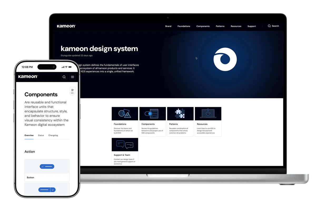
kameon is the software suite of bbg bitbase group in Berlin: a GRC platform for data protection experts, with the Contract, Drive, Task and Academy modules; kameon AUDIT for certification bodies, auditors and internal audit teams; and ePOS for the legally compliant archiving of cash register data. Its buyers are careful people by trade, and the website has to earn their trust before the first demo.
The challenge
The old site ran on Drupal and explained the products in paragraphs and stock photos instead of showing them. kameon AUDIT, the newest product, lived on a separate HubSpot page on another domain. The English version still had a German page title, German menu labels and a German cookie banner, and the English and Spanish legal pages were the German text. Visitors could read that kameon was secure and scalable, but never see what working in it looks like.
My role
I designed and built the new site end to end: the content audit of every page in three languages, the art direction, the drawings and the interactive app scenes, the front-end in Astro and an address structure that keeps every page of the old site.
Four buyers, four kinds of proof
kameon sells to people whose job is to be careful. Before designing a single page I wrote down who the site had to convince: Claudia, who plans four hundred audits a year at a certification body; Thomas, an external data protection officer who looks after thirty five companies; Petra, who has to prove to the tax office that the data of 180 stores is archived; and Elena, a freelance auditor in Madrid who wants to read about it in Spanish. None of them wanted adjectives. Each wanted to see the product doing the part of the job that worries them. Pick any of them below to see what they needed from the site.
- 52 / Female
- Cologne, Germany
- Head of operations, certification body
- 400 audits a year
- Plan audit programmes, sites and standards in one place.
- Check that DAkkS and GDPR requirements are covered.
- Know the price per standard and site before the first call.
- Product pages with stock photos instead of the product.
- Prices hidden behind a sales call.
- Audit content on a different website.
- Devices
- Laptop 80%, iPhone 20%
- Apps
- Outlook, Excel, Teams, Word
- 44 / Male
- Hamburg, Germany
- External DPO, own practice
- 35 client companies
- Contracts, documents, tasks and training for every client in one place.
- Know where the data is stored and who can read it.
- See how kameon fits his own business.
- Security claims with no detail behind them.
- A separate tool for every client.
- Marketing that hides how the product works.
- Devices
- Laptop 70%, iPhone 30%
- Apps
- Outlook, Word, Zoom, LinkedIn
- 48 / Female
- Munich, Germany
- Head of finance, retail chain
- 180 stores, 600 tills
- GoBD-compliant archiving of every till.
- Find anomalies in the DSFinV-K data before an audit.
- A reference from a company like hers.
- Jargon with no explanation.
- No proof from real customers.
- Having to call to understand the basics.
- Devices
- Laptop 85%, iPad 15%
- Apps
- SAP, Excel, Outlook, Teams
- 37 / Female
- Madrid, Spain
- Freelance ISO 27001 lead auditor
- Works for German certification bodies
- Conduct audits on a tablet, offline if needed.
- Reports pre-filled from her findings.
- Read the whole site in Spanish.
- Sites that are only half translated.
- Prices she cannot find.
- Evening follow-up work.
- Devices
- iPad 50%, Laptop 35%, iPhone 15%
- Apps
- Word, Excel, WhatsApp, Google Maps
One map for three products
The old site split kameon across two domains and a menu that mixed products, features and regulations. I rebuilt it around the three products, Audit, the GRC Platform and ePOS, with the four modules under the platform, the customer stories, the resources and the company pages around them. The language switch, the light and dark theme and the demo button sit on every page. Below, the map of the new site; tap any page to read what it does.
Black, violet and glass
The art direction starts from kameon's own colours, the near black and violet of the brand, and adds glass: a top bar that floats as a pill and appears once you scroll, and panels that let the colour behind them through. The hero is a field of dots that leans toward the cursor and ripples when you click, over an aurora taken from the colours of kameon's support centre. The type is Roboto, the same family as the product, so the site and the app read as one thing.
Drawings that explain, instead of stock photos
Compliance software is hard to photograph, so every concept that mattered became a line drawing that draws itself as you scroll. On the GRC Platform, Contract, Drive, Task and Academy sit in two columns and a beam of light travels from each one into the platform in the middle; every icon is a link to its own page. On ePOS the drawing follows the cash register data through the night: every store exports its DSFinV-K data, the archive checks the chain of receipts and the audit protocol comes out at the end.
A menu that shows the product
Products and Solutions open into a glass panel in three parts: the products, the sections of the one you point at, and a real screenshot of it. The screenshots come from the software itself, the Audit dashboard, the Contract module and the ePOS map of locations, so the first thing a buyer like Claudia sees is the screen she would actually work in.
Apps you can try on the page
Each module page opens with a small working copy of the app instead of a photo, drawn in HTML with the real look of kameon: in Contract you sign a contract, in Drive you upload a file, in Task you move a task across the board and in Academy you watch a video and get the certificate. It plays by itself until you touch it, and then it is yours.
Steps that show what they say
How each product works is told in steps. Every step pairs a new photo of someone at work with a glass card on top that plays that step in a loop: the upload, the folders, the shared link, the document request. The text says it once and the card shows it, which is the proof Thomas was asking for.
Three languages, the same addresses
German is the main language, with English and Spanish beside it. Every page exists in all three and the switch keeps you on the same page, so Elena can read the whole site in Spanish. The German addresses are exactly the ones of the old site, so the links and rankings it built over the years carry over, and the English and Spanish versions were cleaned of leftover German and of the typos in the original text.
Dark by default, light on request
The site opens dark, and a switch in the top bar turns it light. The light version is not an inversion: it is built from the cream, white and violet of the old site, so customers who have known kameon for years still recognise it.
Built for the phone as well
Buyers often meet kameon first in a link on their phone. On mobile the menu becomes a full sheet with the products, the modules and the language switch, the drawings and the app scenes keep working at that size, and no text goes below 14 px. Below, the German site on an iPhone: the menu and the way into kameon AUDIT, and a walk from the home page to ePOS and its drawing.
A brand that looks like its product
The redesign set out to raise the way kameon presents itself, and that is where it changed the most. The site now reads as what kameon is: a technology suite of products that work together, not a list of separate offers. The drawings and the app scenes bring the story of each page to life and give visitors something to touch, so they follow the argument by watching the product at work instead of reading claims about it. Together they lift the look of the brand to the level of the software behind it, and Claudia, Thomas, Petra and Elena can each find their product, and watch it work, in their own language.
We are still gathering metrics on how visitors use the new site and how it affects demo requests, to judge how far the redesign has succeeded.